Insane Grain
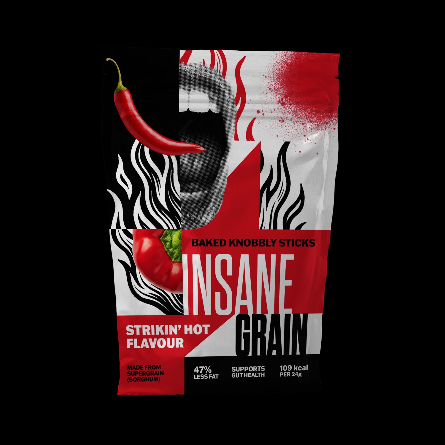
A bold visual identity and snack packaging concept for Insane Grain, combining expressive typography, distressed graphics, and high-contrast colors to give the brand a rebellious personality.
- Role
- Brand & packaging design
- Tools
- Photoshop, Illustrator
- Deliverables
- Pouch, Strikin' Hot flavor, graphic system, mockups
Insane Grain is a health snack brand aimed at a younger audience. The identity takes a more unconventional approach to health-food branding, using the energy of punk graphics and street culture to communicate the brand's character. The challenge was to make the packaging visually loud without sacrificing the clarity of the product name, flavor, and nutritional information.
- Brand identity and visual direction
- Logo and typographic treatment
- Packaging design
- Product information and nutritional hierarchy
- Final packaging mockups
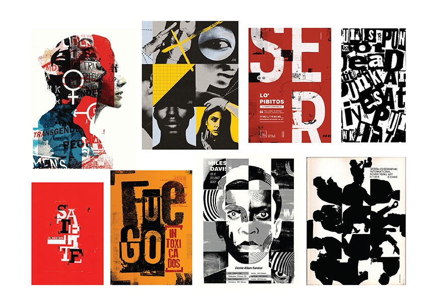
Borrowing from collage posters
I pulled collage portraits, halftone photography and loud poster typography: work that feels cut up, layered and a little unhinged, which is exactly what the name asks for.
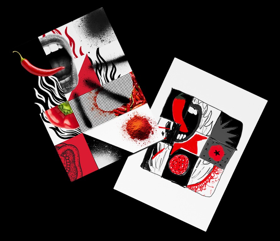
Two early directions
A digital collage tested how photography, halftone and flat colour could share one surface. A marker sketch blocked out the grid underneath it.
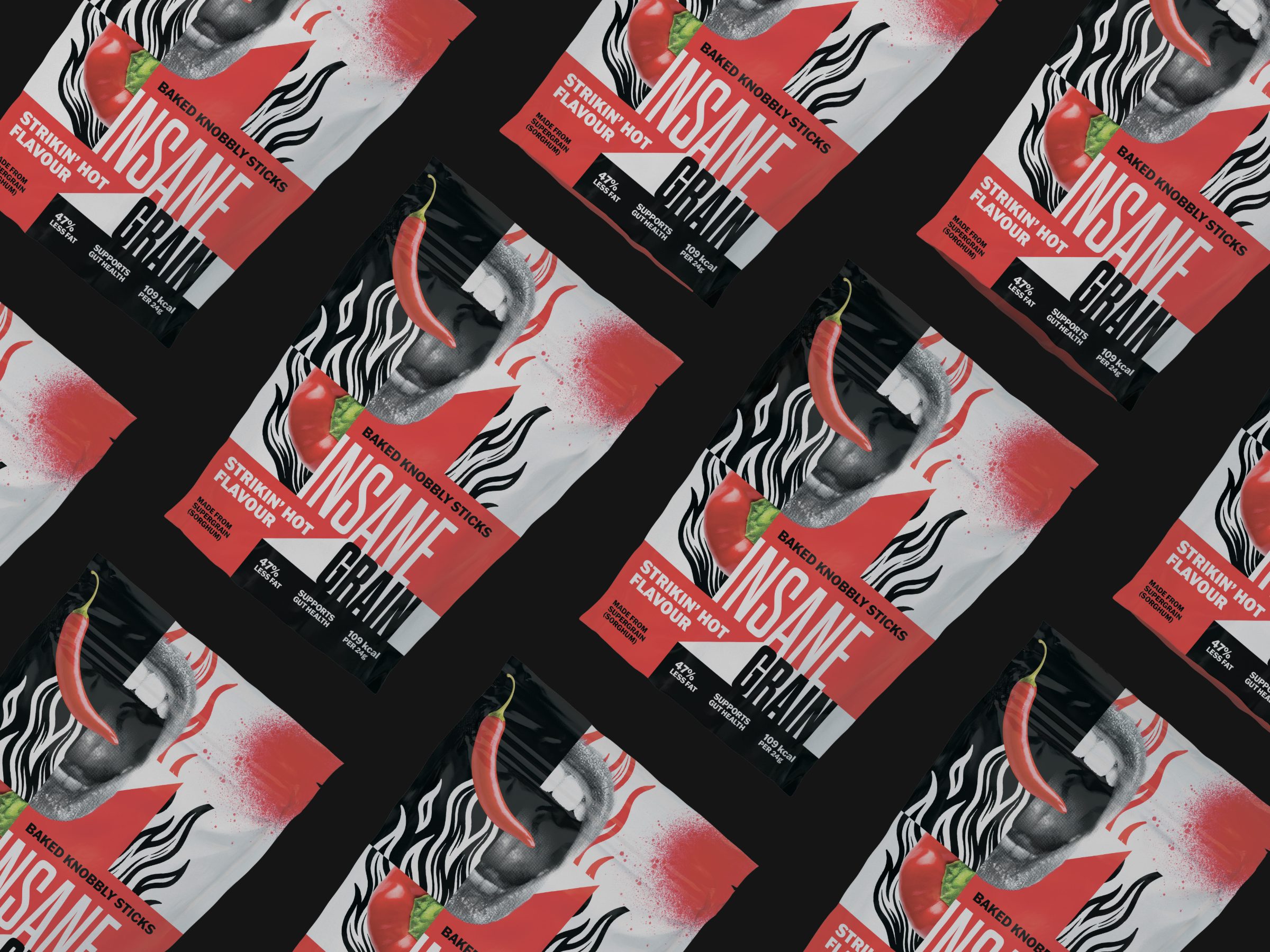
Out in the world
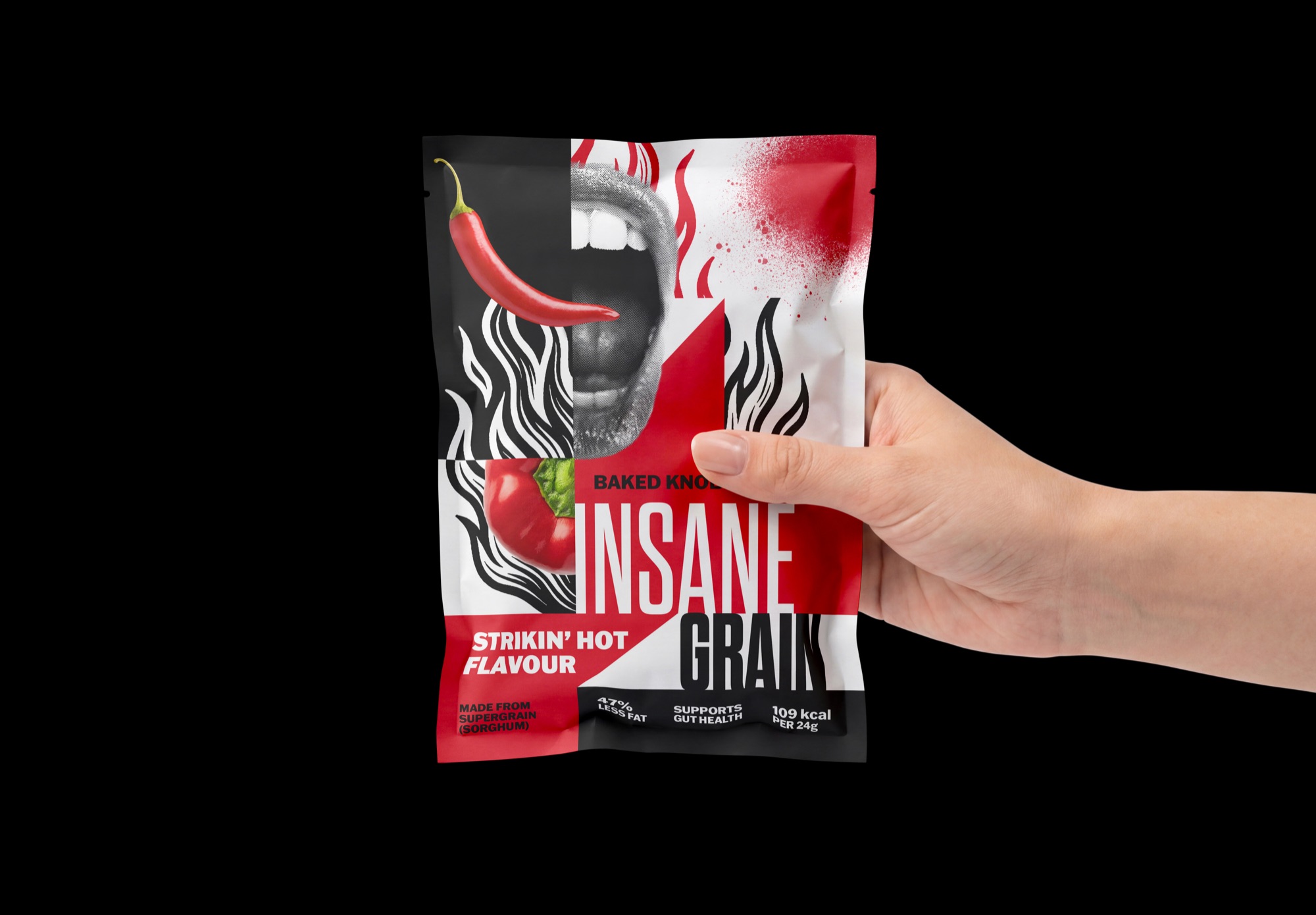
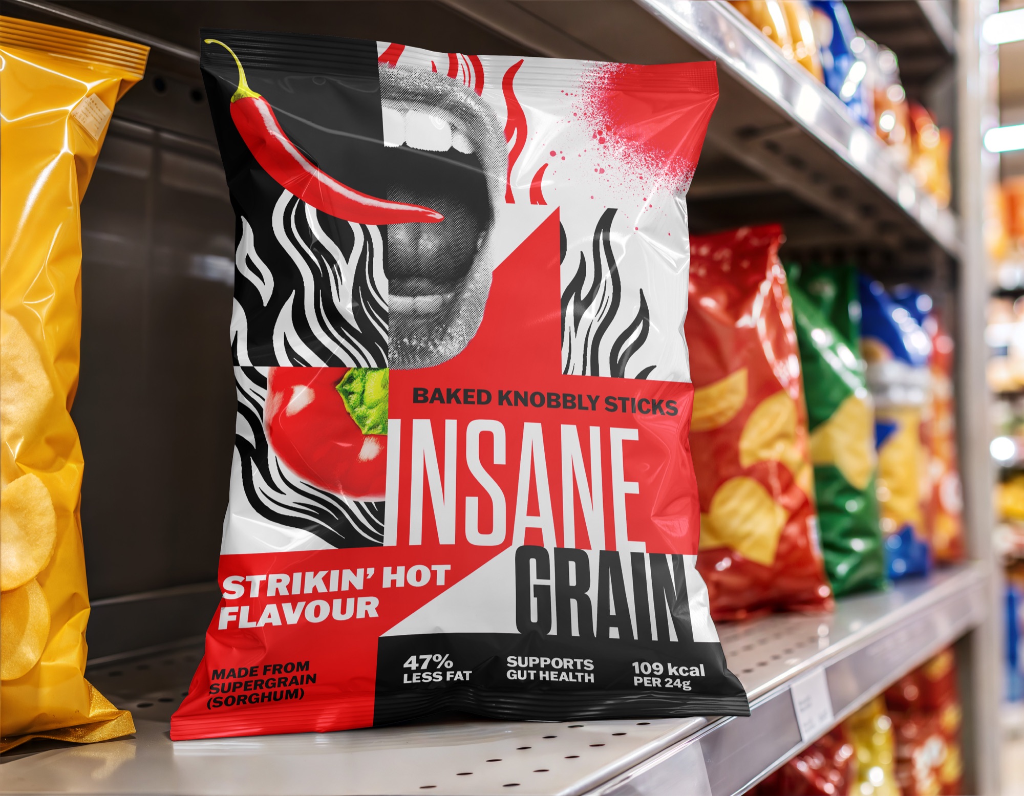
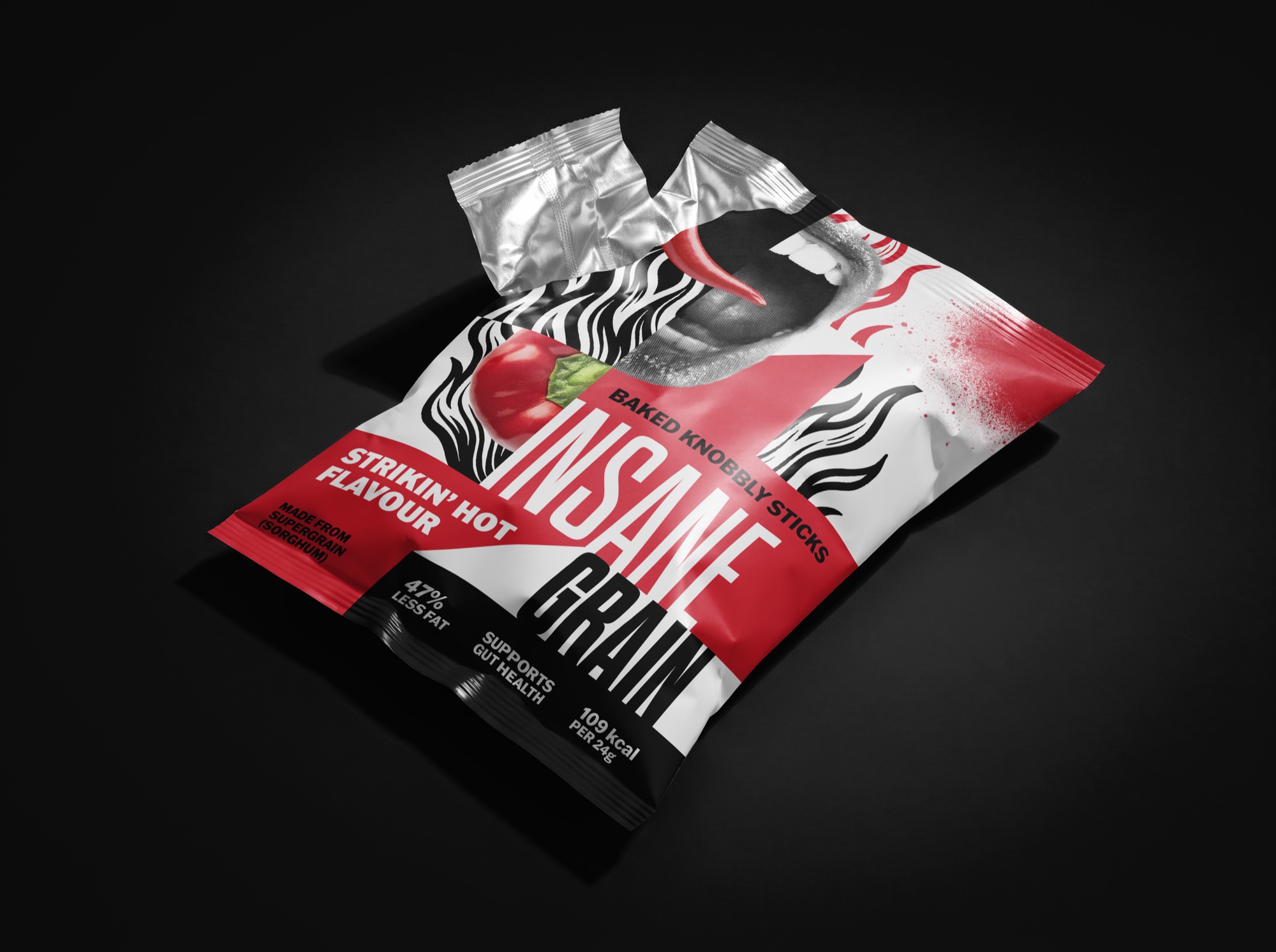
The identity is built around a bold, high-impact visual language. Tall condensed lettering gives the brand name a strong presence, while distressed textures, halftone imagery, and sharp contrasts bring a raw, almost poster-like quality to the packaging.
The front of the pouch uses a halftone screaming mouth and a photographic chili pepper to communicate intensity and flavor. Wavy black-and-white stripes interrupt the composition, while red panels and splatter graphics create movement across the surface. The wordmark remains prominent against this busy background, with the flavor name and nutritional claims organized into a separate band at the bottom.
The contrast between the expressive graphics and the more structured information is intentional. The identity feels energetic and unconventional, but the hierarchy still gives the product a clear name, flavor, and set of nutritional details.