Surendra
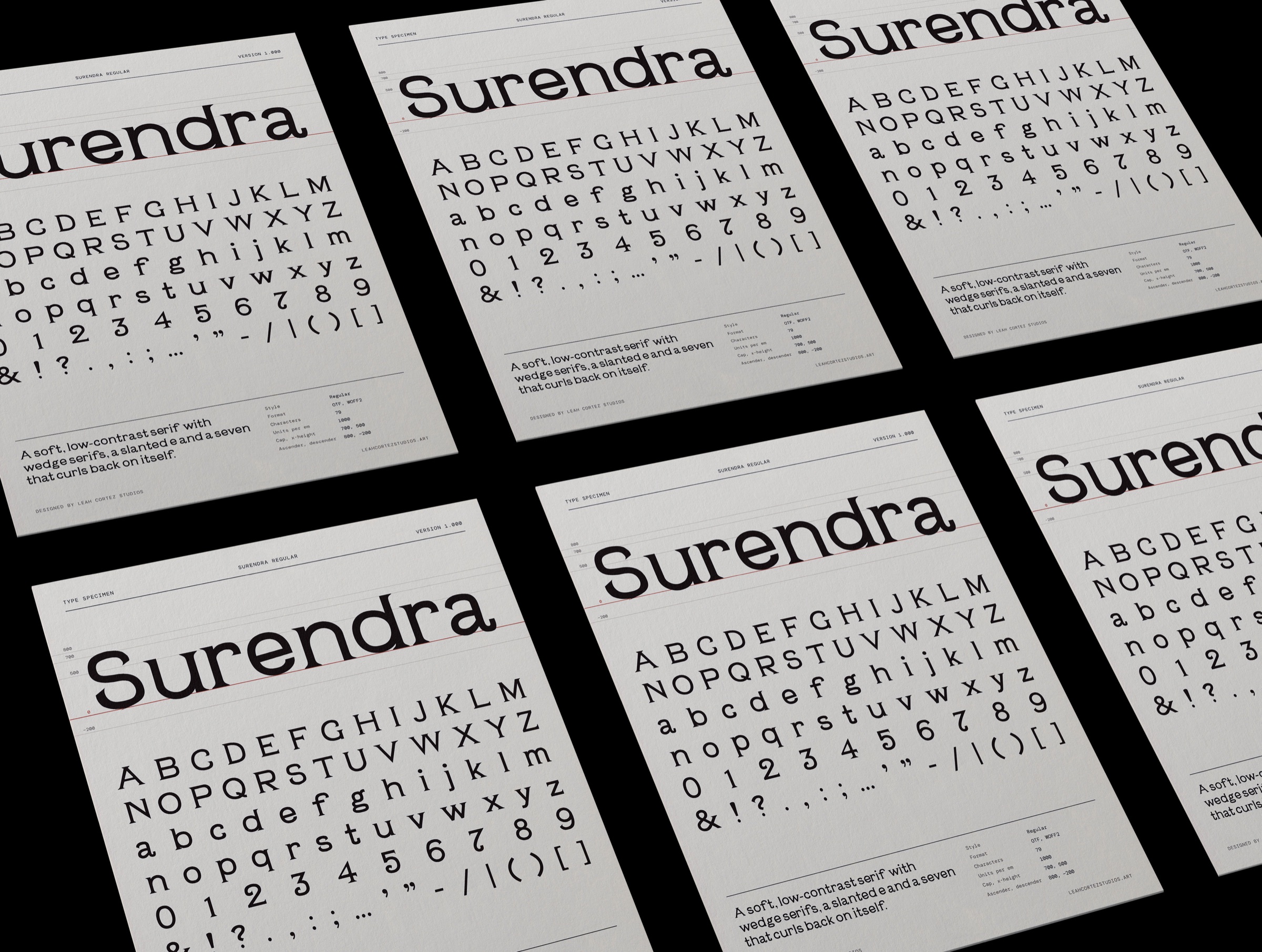
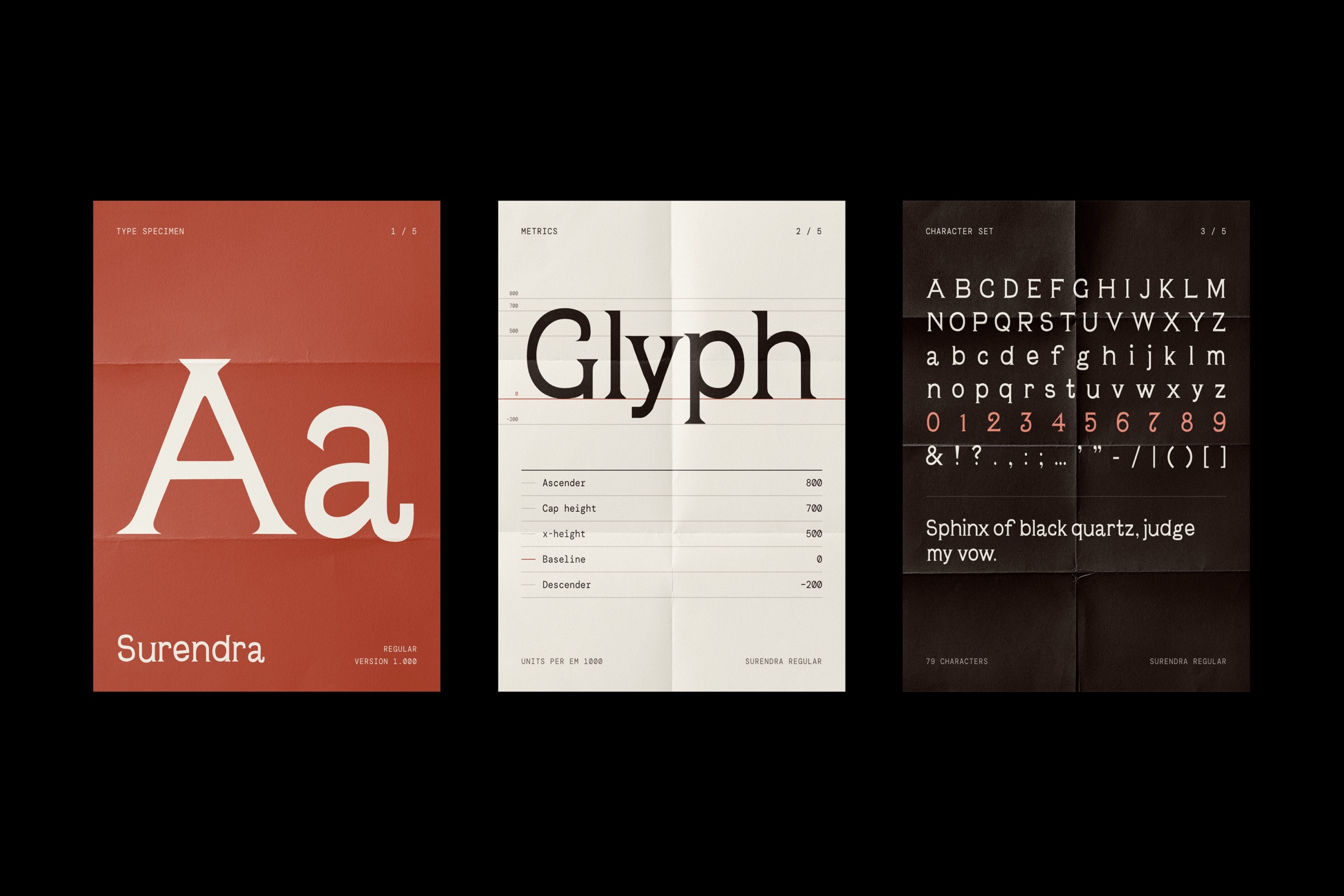
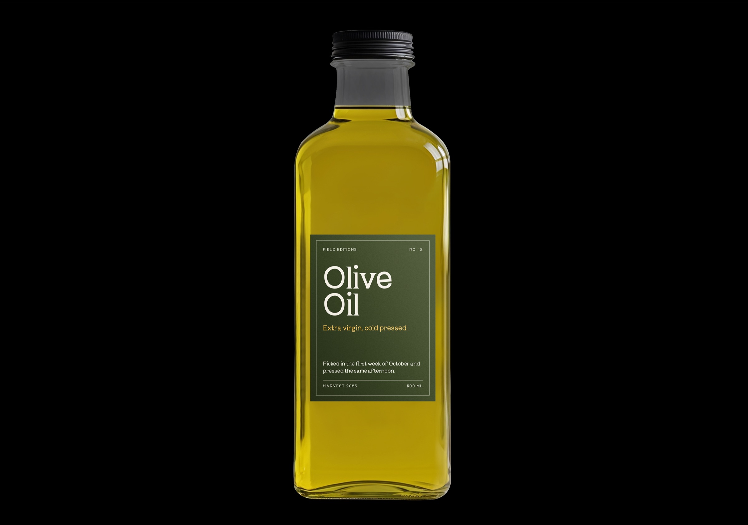
A digital typeface drawn from historical wood and metal type, shown in a specimen poster. Every heading on this site is set in it.
- Role
- Typeface design, graphic design
- Deliverables
- Typeface, glyph set, specimen poster
Reinterpret old wood and metal type specimens as a new digital typeface, instead of just copying an archival one.
I drew the glyph set from those references, then worked through spacing, kerning and consistency across every character.
A working display face and a specimen poster that shows off its forms. It is also the voice of this whole site.
Starting from old type.
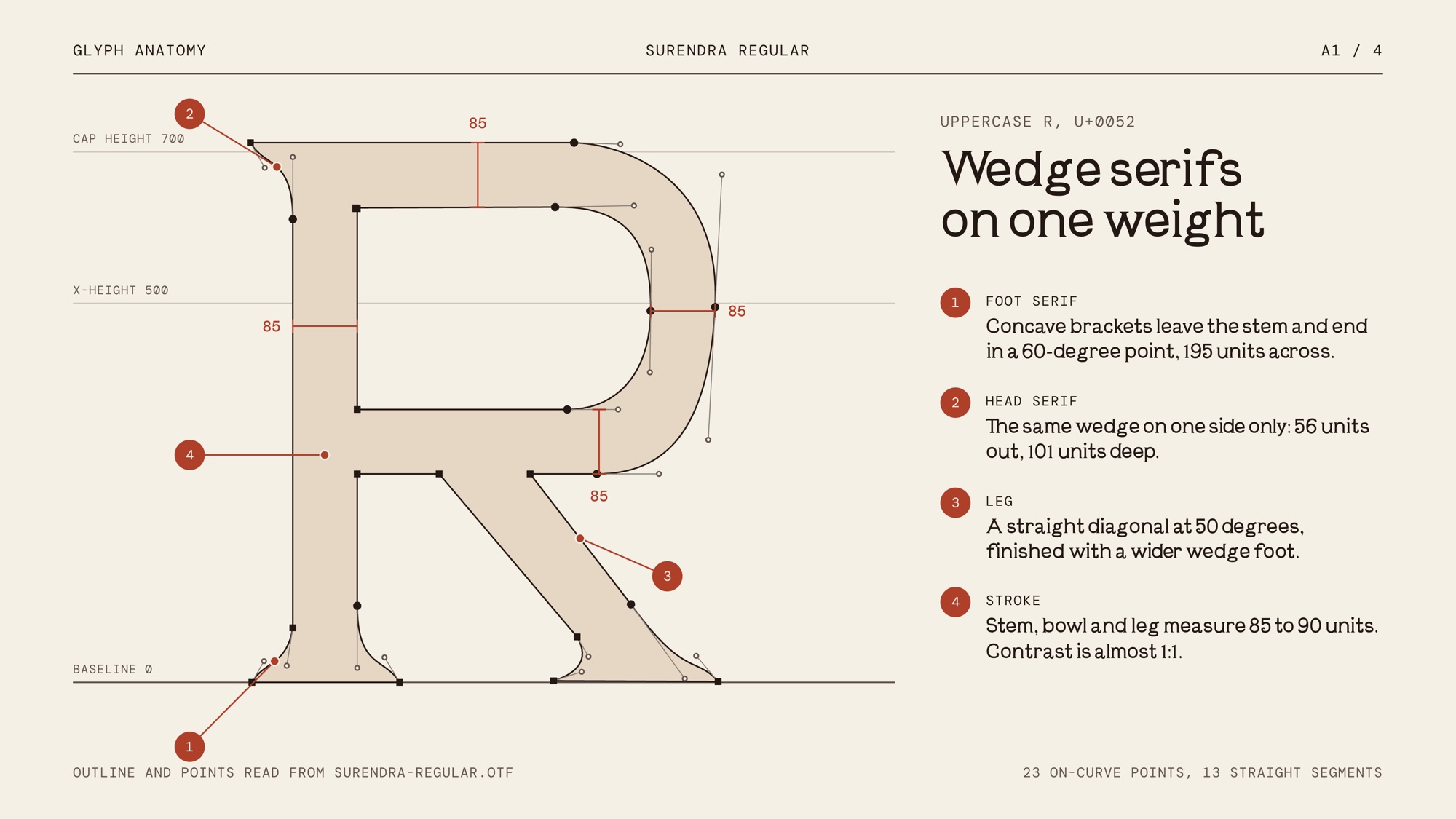
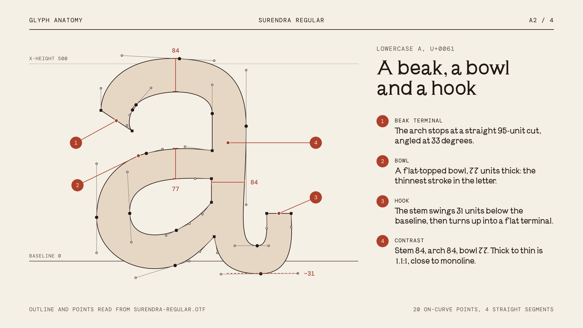
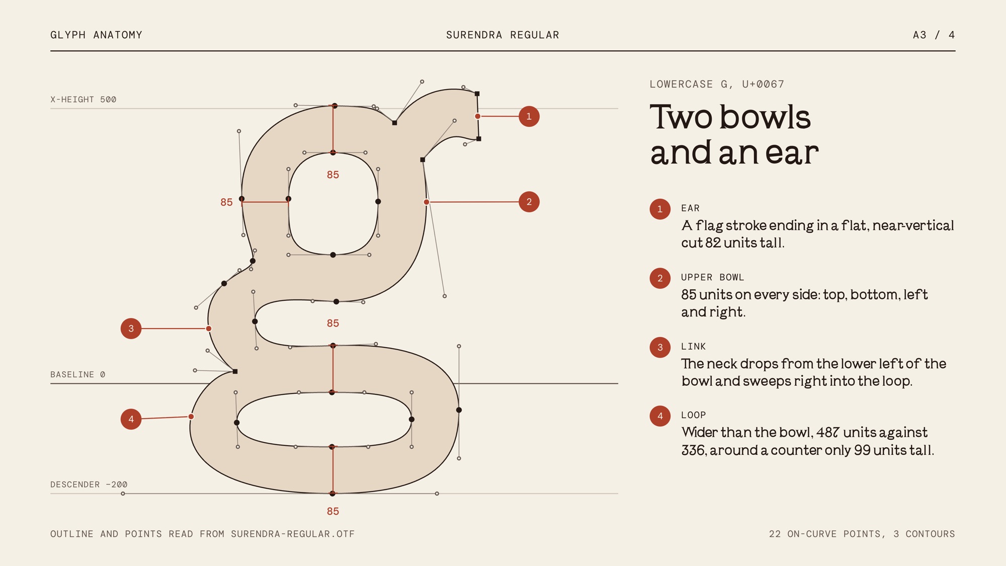
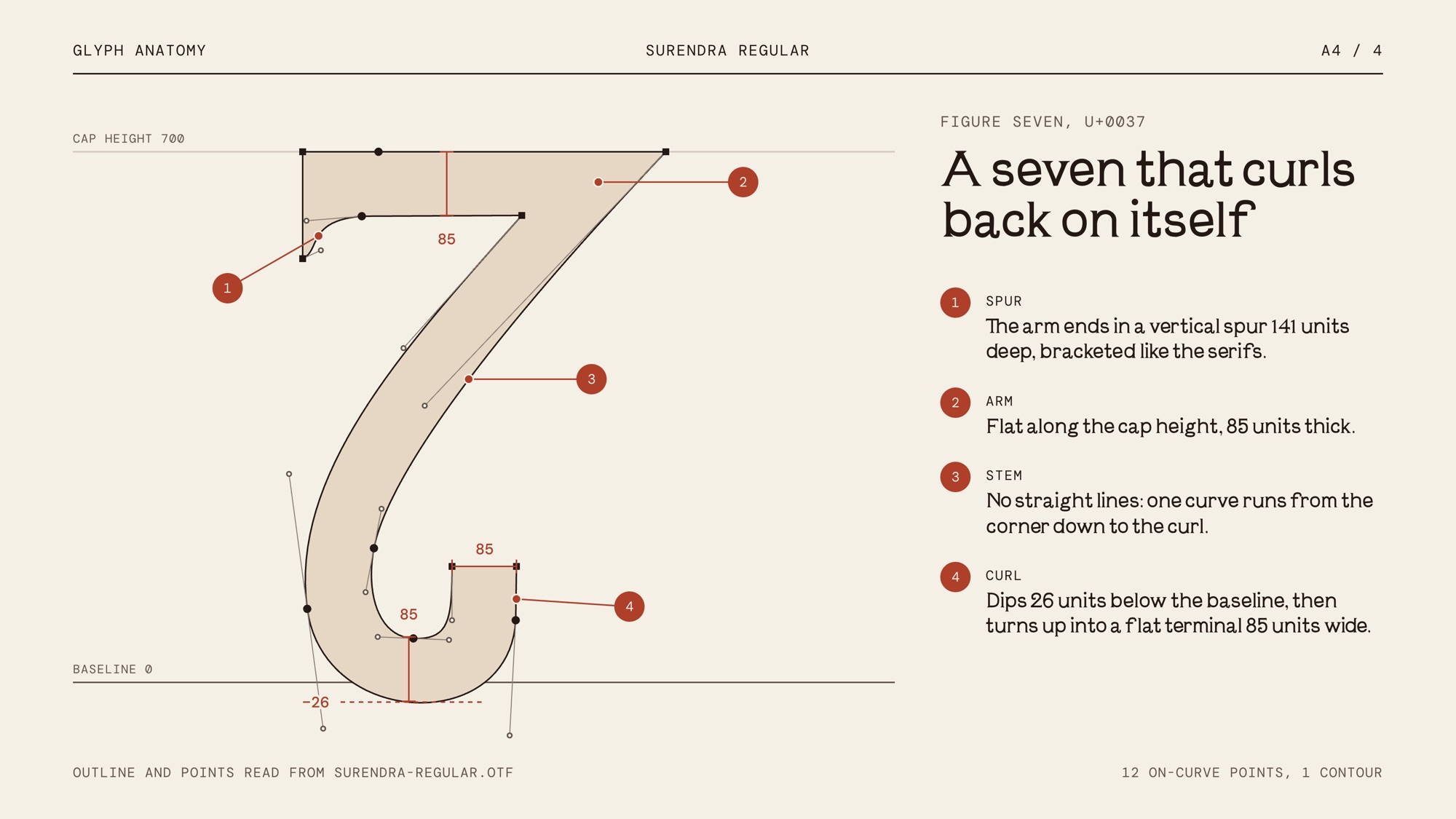
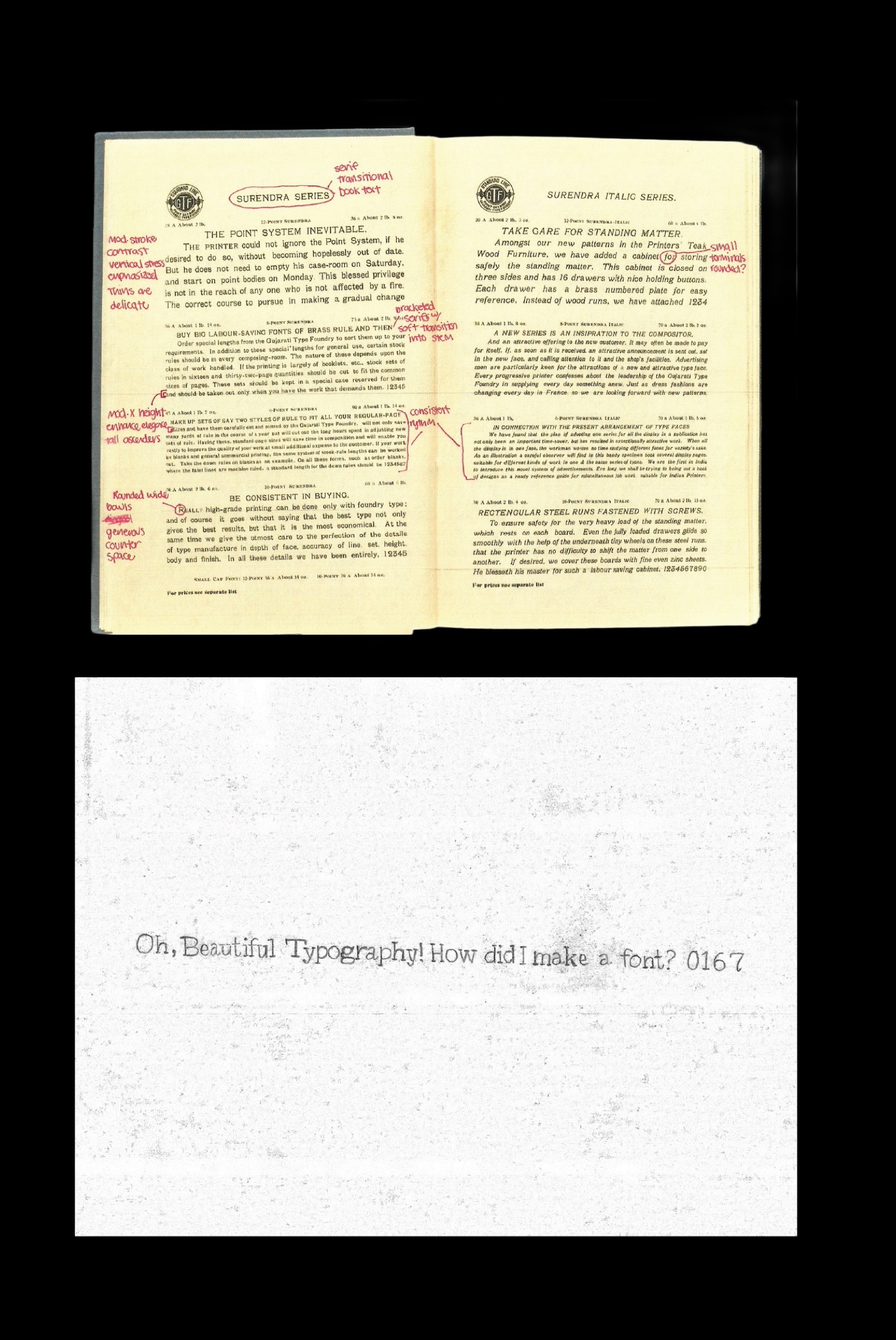
I collected wood and metal type specimens and studied what made their letters feel so physical: uneven weight, soft corners, and the way ink spreads at the edges. The goal was to borrow that character without copying any one archival face.
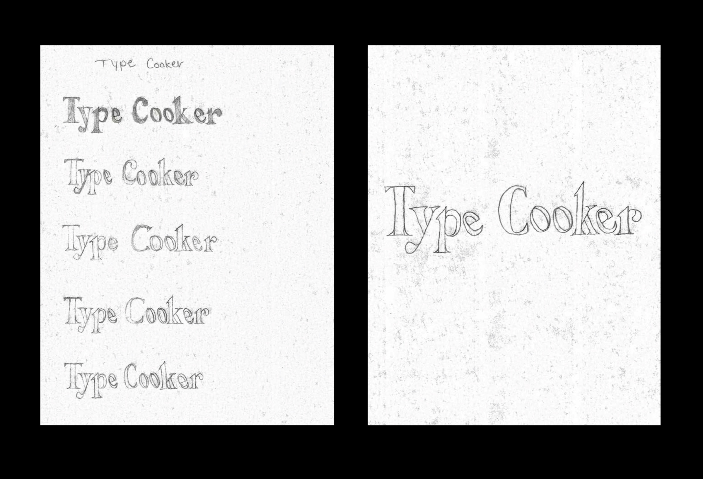
Drawing the glyph set.
I sketched the letterforms by hand first, then rebuilt them digitally. From there it was spacing, kerning and consistency, checking that every character belonged to the same family.
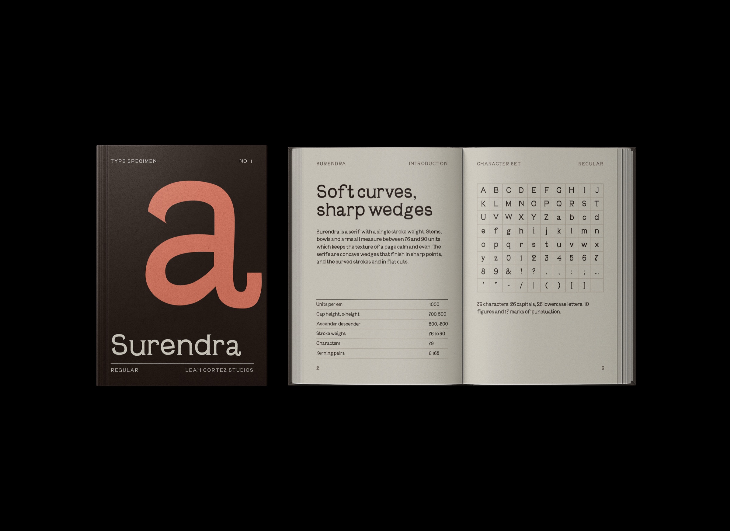
The parts of the letters.