Alien Invasion or Sleep Paralysis?
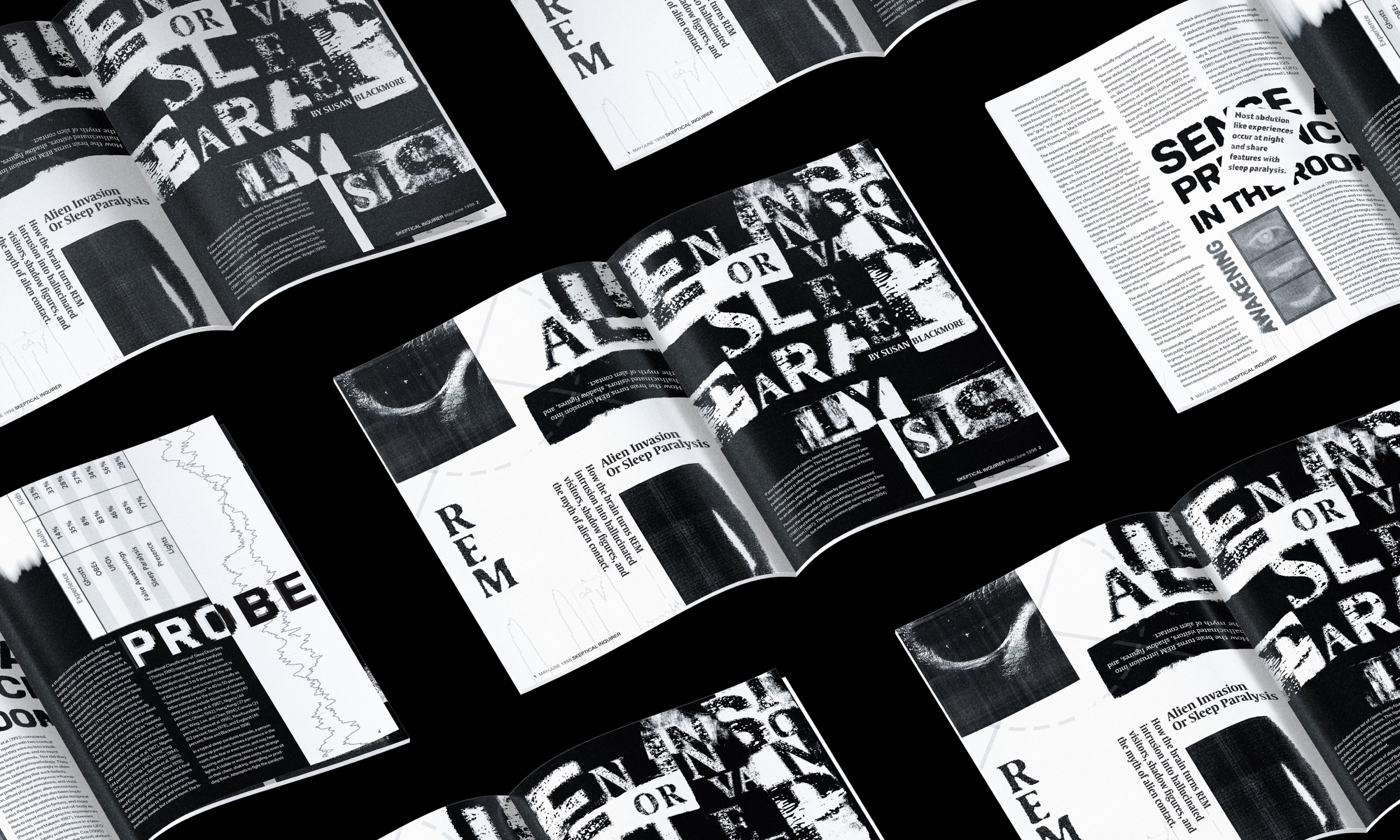
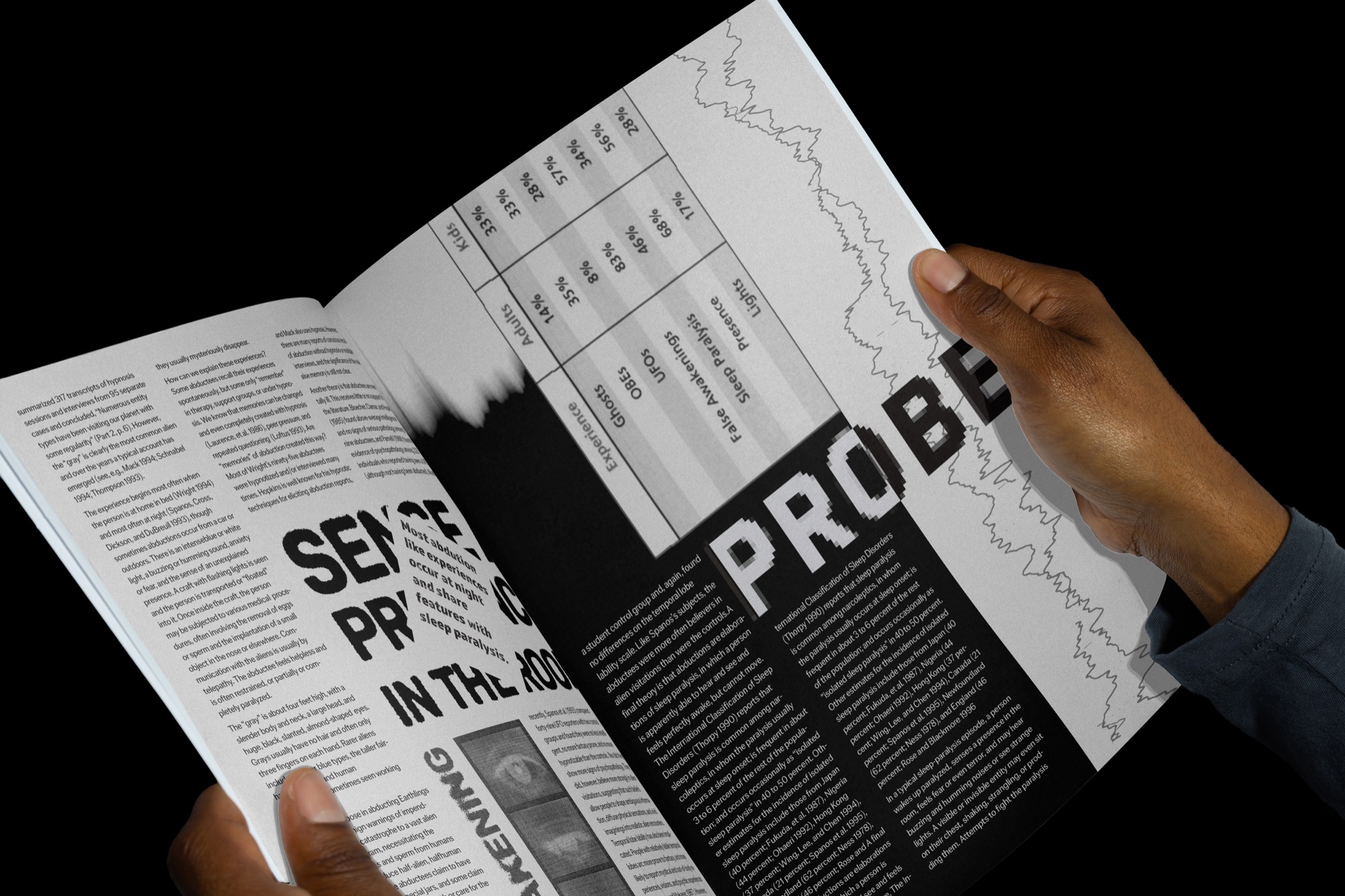
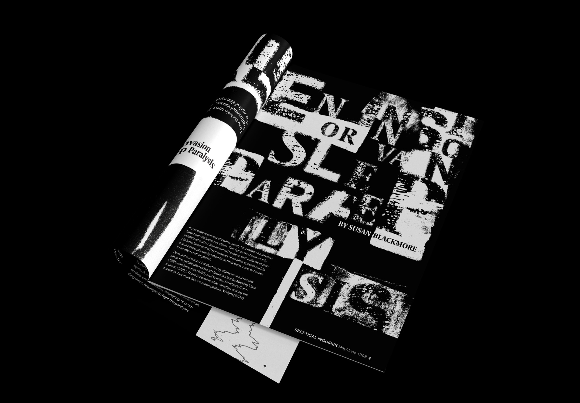
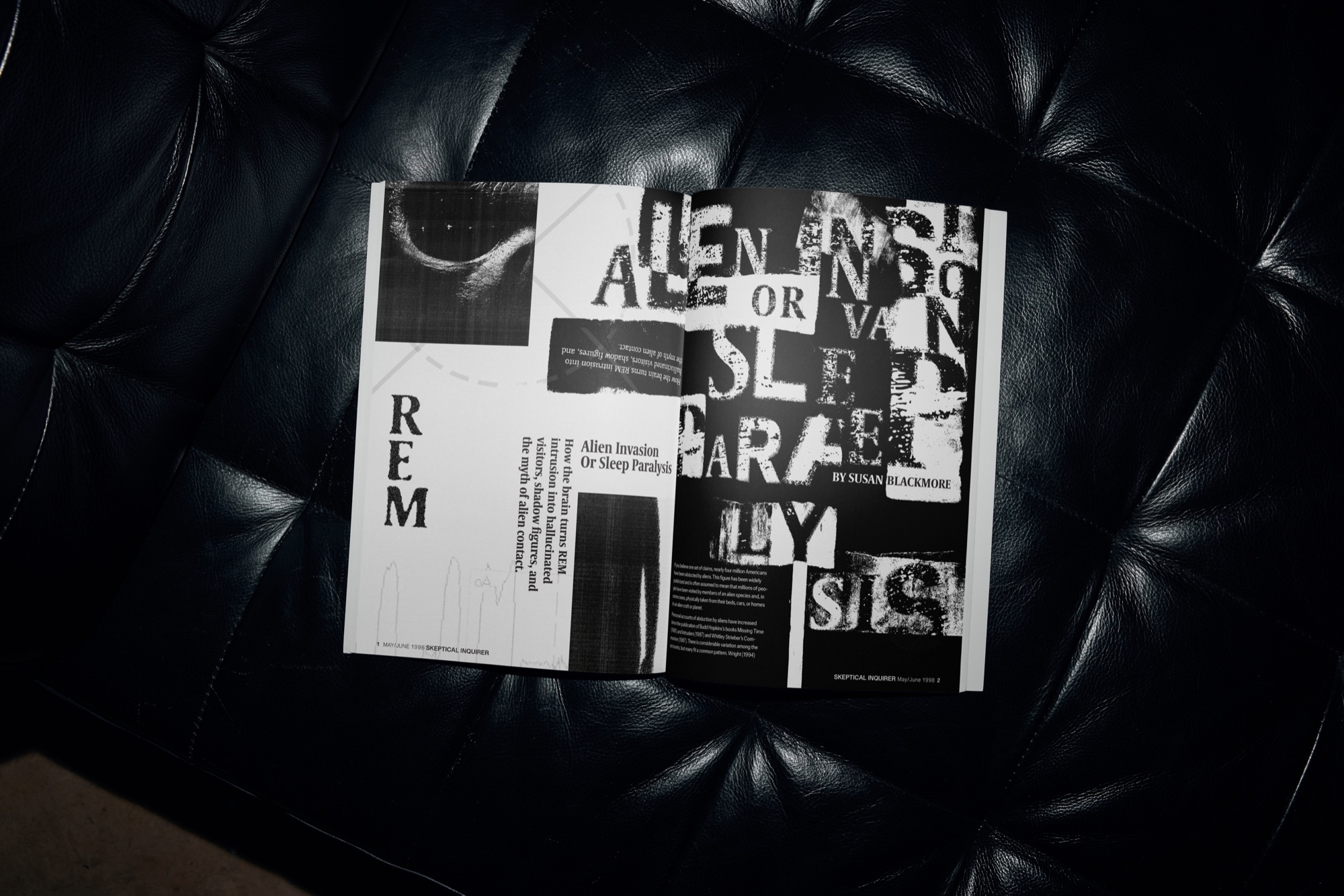
A black-and-white editorial spread exploring sleep paralysis through distorted headline typography, dark photography, and a structured text grid.
- Deliverables
- Editorial spreads, display type, black-and-white imagery
The article explores sleep paralysis and experiences that people may associate with alien encounters. I wanted the layout to reflect the uncertainty of the subject without making the article itself difficult to read.
The central design decision was to create a contrast between visual disorientation and editorial structure: the opening feels unstable, while the body text returns to a more controlled layout.
- Article analysis and research
- Thumbnail layouts
- Typography and composition studies
- Image selection and cropping
- Final two-page editorial spread
Type that comes apart
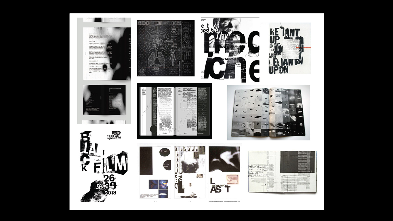
I collected experimental editorial and poster work: chopped-up headlines, grainy black-and-white photos, pages packed with dark text. What they share is a sense that something is slightly off, which suits an article about waking up and not being able to move.
Where the headline lands
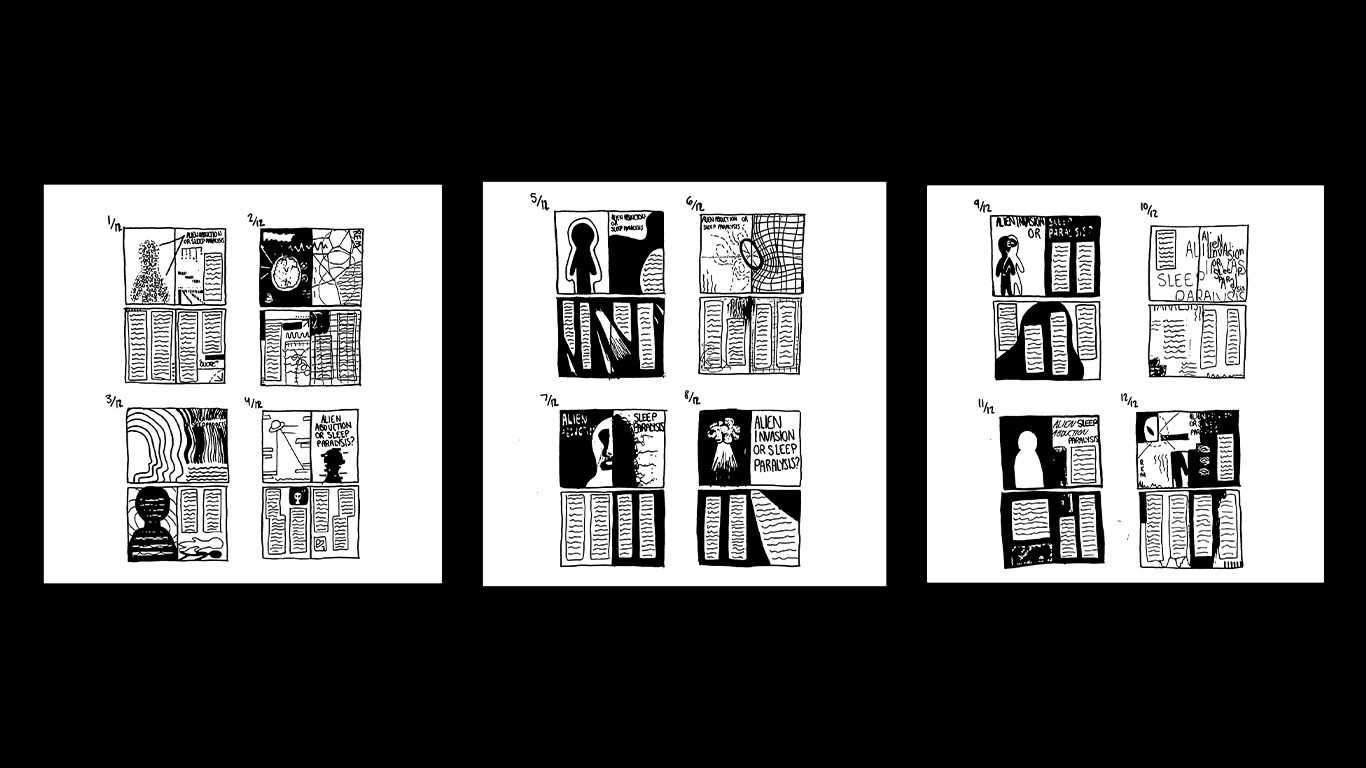
Black marker thumbnails tested where the title would sit against the text columns. Keyholes, clocks and figures at the edge of the frame were early image ideas, and each version pushed the type a little further before I settled on how far it could break.
Concept development
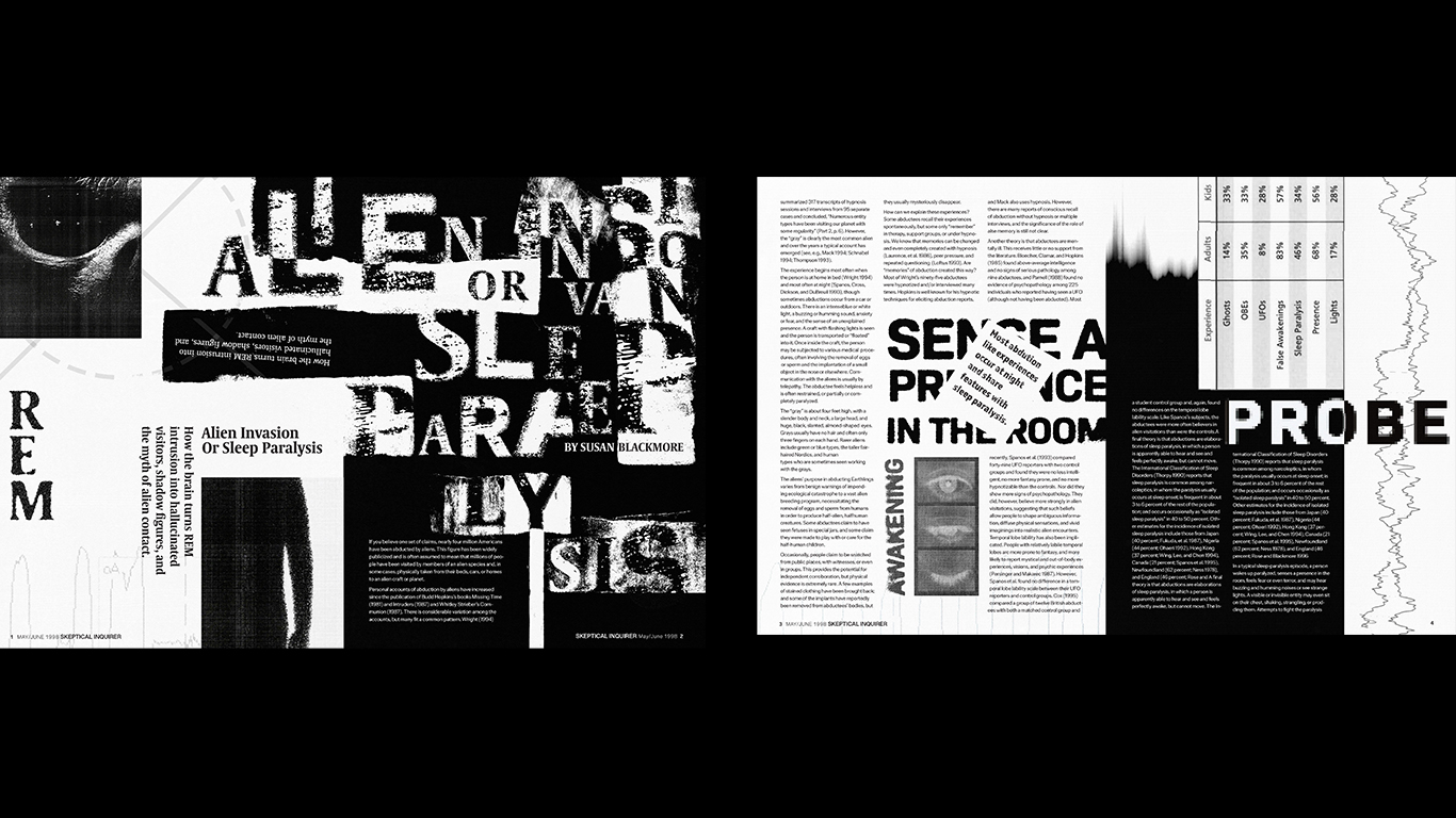
Keyholes and clocks were my first ideas, and they turned the spread into a horror poster. The article is about not knowing which explanation is true, so I let the type carry the unease and kept the photos dark and cropped. The headline breaks across the page, but the body text stays in narrow, ordered columns, so it still works as an article. Black and white only, because color would have picked a side.