Double-Sided Poster
The Almost Right Word: Will Rogers & the Boundlessness of Ignorance
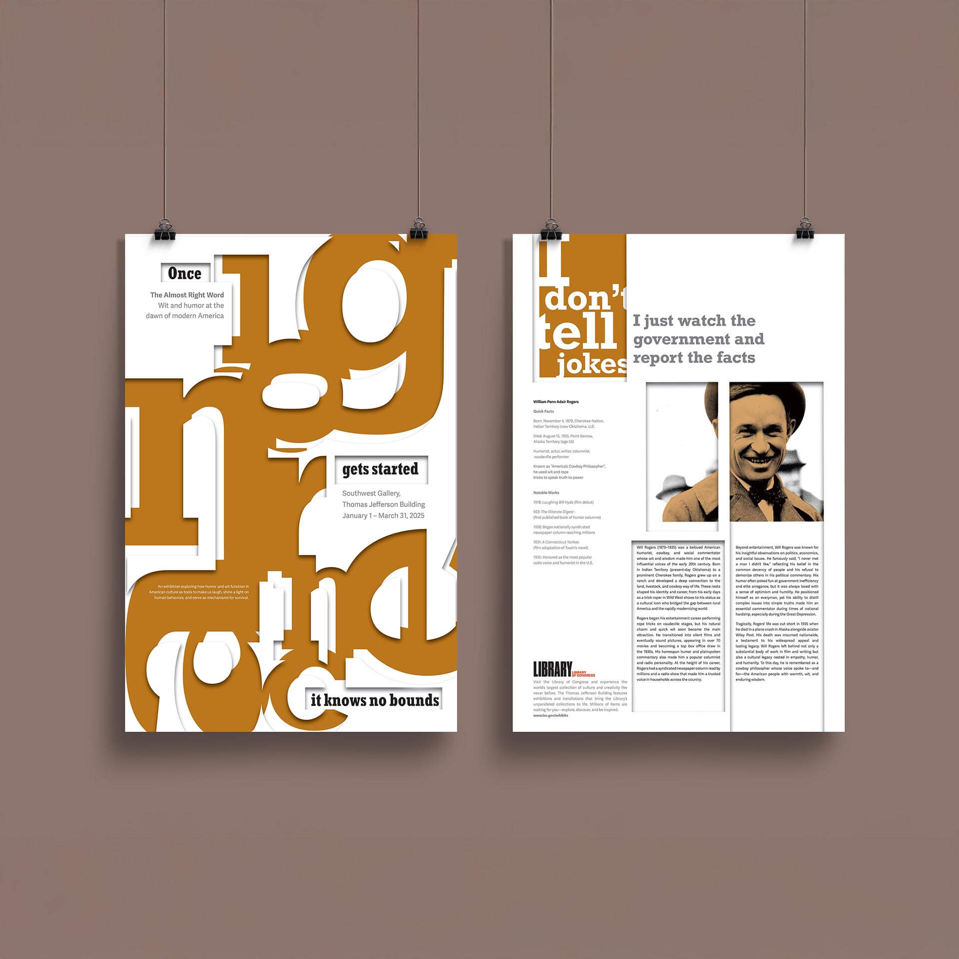
Overview
A typographic exploration of misinformation through visual disruption
Challenge
Design a double-sided poster for the exhibition The Almost Right Word: Wit and Humor at the Dawn of Modern America, presented by the Library of Congress. Create typographic interpretation of Will Rogers' quote while maintaining exhibition functionality.
Course
GRDS 1302 Typography I
Timeline
Academic Project - Typography I
Skills
Typographic distortion, layout design, conceptual development, exhibition design
Design Impact
Successfully created a typographic metaphor for information corruption that functions as both exhibition piece and social commentary. The design demonstrates how visual distortion can embody complex concepts while maintaining core communication goals.
Design Process
From initial sketches to final typographic solution
Initial Concept Exploration
I began by sketching two distinct approaches to visualizing Will Rogers' quote about ignorance. The first concept focused on typographic distortion and misalignment to represent how misinformation disrupts clear communication. The second approach explored fragmented layouts and visual chaos to show how ignorance fragments our understanding of truth.
Conceptual Synthesis
After analyzing both sketch directions, I realized the strongest solution would combine elements from both approaches. The typographic distortion from the first concept would work powerfully on the front side, while the fragmented layout approach from the second sketch would be perfect for disrupting the biographical content on the back side.
Typography Development
I developed the concept of enlarged, skewed slab serif letterforms that would misalign and overflow the poster boundaries. This visual approach directly represents how misinformation destabilizes clarity and coherence, allowing ignorance to "know no bounds" as Rogers warned.

Design Execution
Two-sided approach to typographic disruption
Front (Quote Side)
- Exaggerated and fragmented "ignorance" to reflect how misinformation warps communication
- Bold slab serif type channels the rugged Western tone of Rogers' persona
- Intentional misalignments and spacing shifts express the quote's warning about unpredictable expansion
- Warm oranges and neutrals nod to Western landscape while reinforcing unease
Back (Biographical Side)
- Extended visual breakdown: misaligned columns, disrupted hierarchy, fractured rhythm
- Portrait of Will Rogers grounds the message in historical and cultural context
- Typography mimics truth disguised by coherence—maintaining structure while subtly breaking it
- Challenges viewer to find clarity in broken order, questioning misinformation
Final Outcome
Typography as misinformation metaphor

Design Resolution
A double-sided poster that uses typographic chaos as metaphor for information corruption. The design successfully demonstrates how visual distortion can embody complex social concepts while maintaining its primary function as an exhibition piece.
Key Elements:
- Typographic Distortion: Visual metaphor for how truth becomes corrupted
- Dual-Sided Format: Contrasts clarity with fragmentation
- Cultural Reference: Western aesthetics honor Rogers' cowboy persona
- Readable Chaos: Maintains communication while demonstrating corruption
The poster successfully captures Will Rogers' warning about ignorance while creating a contemporary commentary on misinformation through pure typographic expression.
Results & Reflection
Typography as conceptual commentary
Project Impact
This project deepened my understanding of how typography can be used to visually critique communication itself. I learned how to turn a typographic layout into an active metaphor, pushing beyond legibility into conceptual commentary.
The poster successfully demonstrates how design can embody complex social concepts while maintaining its primary function as an information vehicle.
What I Gained
- Techniques for balancing disruption and design unity — maintaining coherence while expressing chaos
- Stronger storytelling through type, space, and rhythm — using typography as narrative device
- Experience using typefaces and grid as narrative tools — structural elements become meaning-makers
- A deeper appreciation of typography's ability to embody tone and critique — type as social commentary
Design Philosophy:
Effective design can simultaneously function and critique, serving its practical purpose while commenting on larger social issues. Typography becomes most powerful when it transcends mere communication to embody the very concepts it represents.