Elements & Principles
Reimagining design fundamentals through cultural lens and contemporary practice
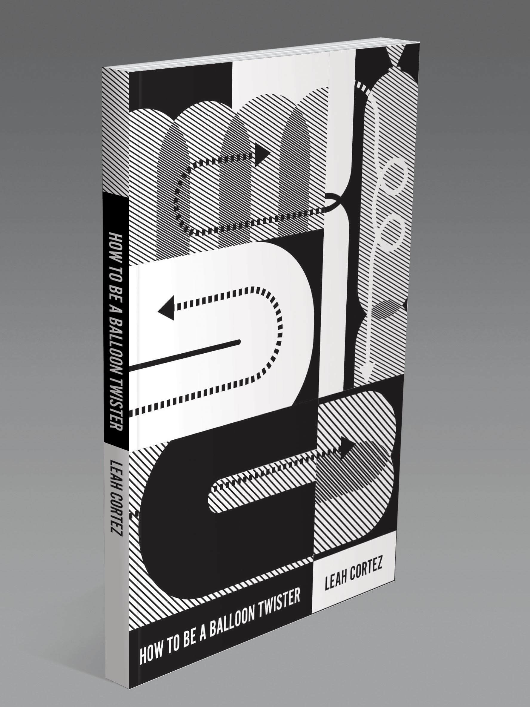
Project Overview
Challenge
Design a how-to book cover that communicates its subject matter using the formal design principles it teaches. The challenge was to convey clarity, structure, and instruction while appealing to modern design students through a culturally inclusive and conceptually rich visual language.
Approach
Using a 3x3 grid system, I created a composition that mirrors the structure of vintage instructional manuals, with geometric forms and typographic manipulation that emphasize visual hierarchy, contrast, rhythm, and balance. The goal was to visualize the very design principles discussed in the book, while introducing elements inspired by non-Western cultural aesthetics and playful material references.
Educational Philosophy
This cover reframes traditional graphic design education by highlighting global design influences and proving that pedagogy can be both educational and stylistically bold.
Design Strategy
Demonstrating principles through practice
Principle Analysis & Conceptual Development
- Educational Clarity Focus — Identified design principles most effective for instructional communication
- Visual Hierarchy Mapping — Strategic emphasis through hierarchy, direction, and layering
- Form and Layout Exploration — Balloon twisting metaphors through translucent forms and structural cropping
- Breathable Composition — Bold yet accessible design for modern design students
Cultural Integration & Execution
- Balloon Aesthetic References — Inflated sculpture forms with airiness and dimensional movement
- 3x3 Grid System — Mirrors structure of vintage instructional manuals
- Layering and Transparency — Directional arrows guide viewer through grid system
- Non-Western Cultural Elements — Global design influences beyond traditional Western pedagogy

Grid composition studies exploring shape, value, and pattern relationships
Final Outcome
A textbook cover that teaches while it attracts

Final Outcome
A textbook cover that teaches while it attracts.
- Emphasizes a bold instructional grid
- Combines typographic structure with playful geometric abstraction
- Uses cultural form metaphors (balloons, air, twist) without becoming literal
Design Rationale
- Hierarchical Typography — Clear flow and functional contrast
- Balloon Forms — Abstracted inflated curves and translucent layers suggest air and play
- Grid Discipline — 3x3 system that organizes chaos into form
- Instructional Movement — Arrows and diagonals walk the viewer through visual steps
- Inclusive Appeal — Visually progressive without sacrificing legibility
Results & Reflection
Project Outcomes:
- Educational Impact: Demonstrates visual principles directly
- Contemporary Relevance: Speaks to modern design students
- Cultural Inclusion: Softly disrupts Eurocentric design assumptions
- Professional Finish: Suitable for academic or industry use
Key Learnings:
This project taught me how to embed theory into visual practice. I learned that design doesn't just talk about principles — it can perform them. It also deepened my approach to inclusive educational content.
Future Application:
I aim to continue designing projects that combine theory with contemporary aesthetics and culturally inclusive visual language — especially for educational, editorial, and institutional design.