Reductive Photo Solutions
Vinyl LP Cover Design for Blue Note Records
Project Overview
Challenge
Design the cover of a vinyl LP for the Blue Note label using a reductive photographic treatment. The source image must be selected from the William P. Gottlieb jazz photography collection (Library of Congress). The final composition should reflect the Blue Note visual identity, incorporating reductive photos, slab/sans serif typography, mechanical color palettes, abstract forms, and asymmetry.
Approach
This album cover interprets the smooth, melodic jazz style of swing-era trumpeter Buck Clayton. The concept draws from the album title "Swingin' Dream" and seeks to capture both the emotional atmosphere and the visual rhythm of Clayton's performance style, translating sound into visual language through image reduction, form, and layout.
Portfolio Professional
Music Industry Design Exploration
Project Type: Album Cover Design & Visual Identity
Focus: Publication Design · Typographic Layout · Photo Manipulation · Jazz Visual Language
Design Process
Concept + Design Strategy
Concept Development
- Sound to Visual Translation — Expressing the flow, elegance, and swing of music through image reduction and layout
- Performance Photo Selection — Buck Clayton mid-performance as directional visual anchor
- Blue Note Visual Language — Honoring the label's iconic design ethos while adding personal interpretation
Visual Treatment & Execution
- Color Palette Strategy — Soft lavender and neutrals evoking dreamy swing atmosphere
- Halftone Photo Treatment — Coarse screen creating vintage tactility
- Geometric Layering — Stylized shapes creating musical movement and asymmetrical balance
- Typography Integration — Clean sans-serif aligned with Blue Note legacy
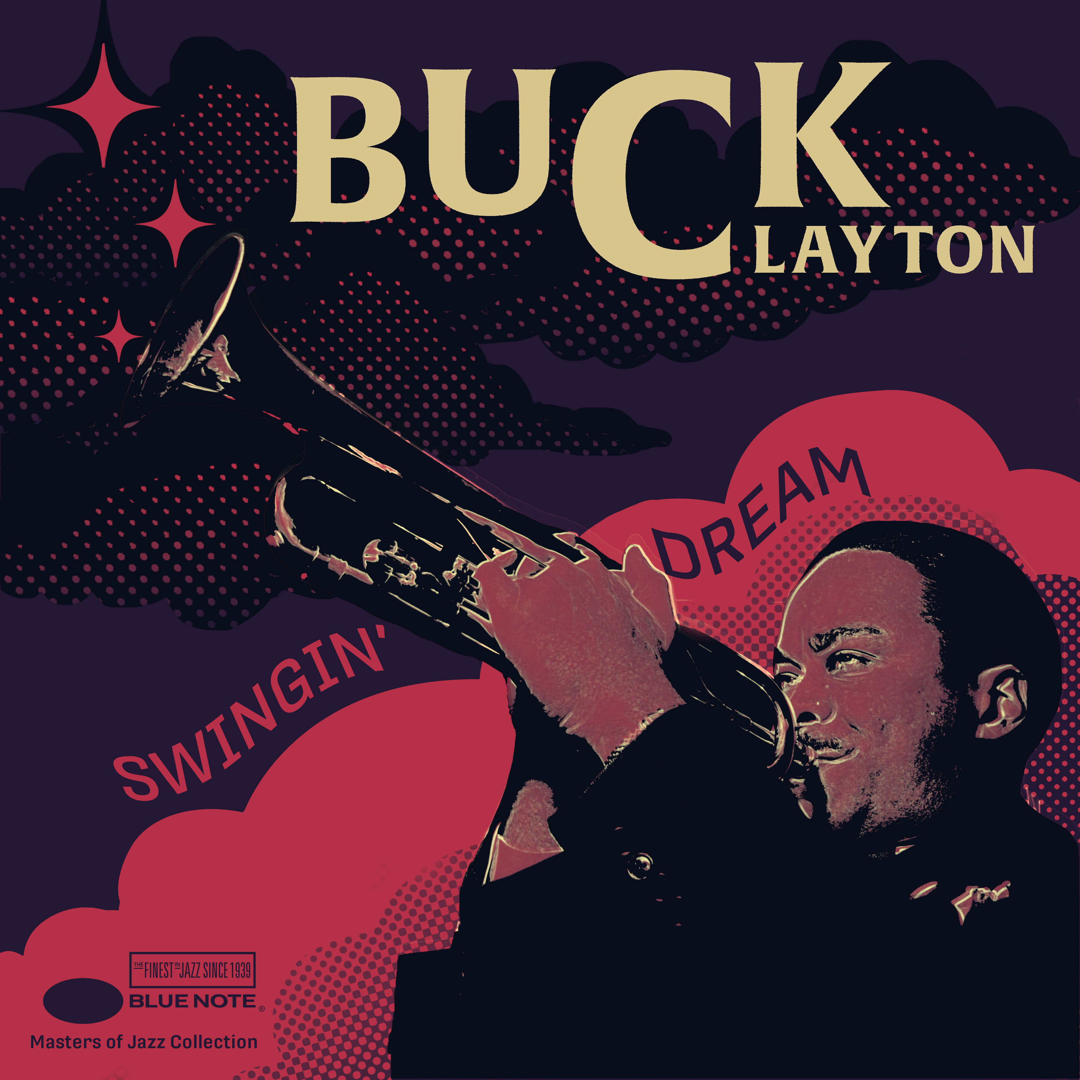
Experimental variation exploring bolder graphic interventions before refining to Blue Note aesthetic
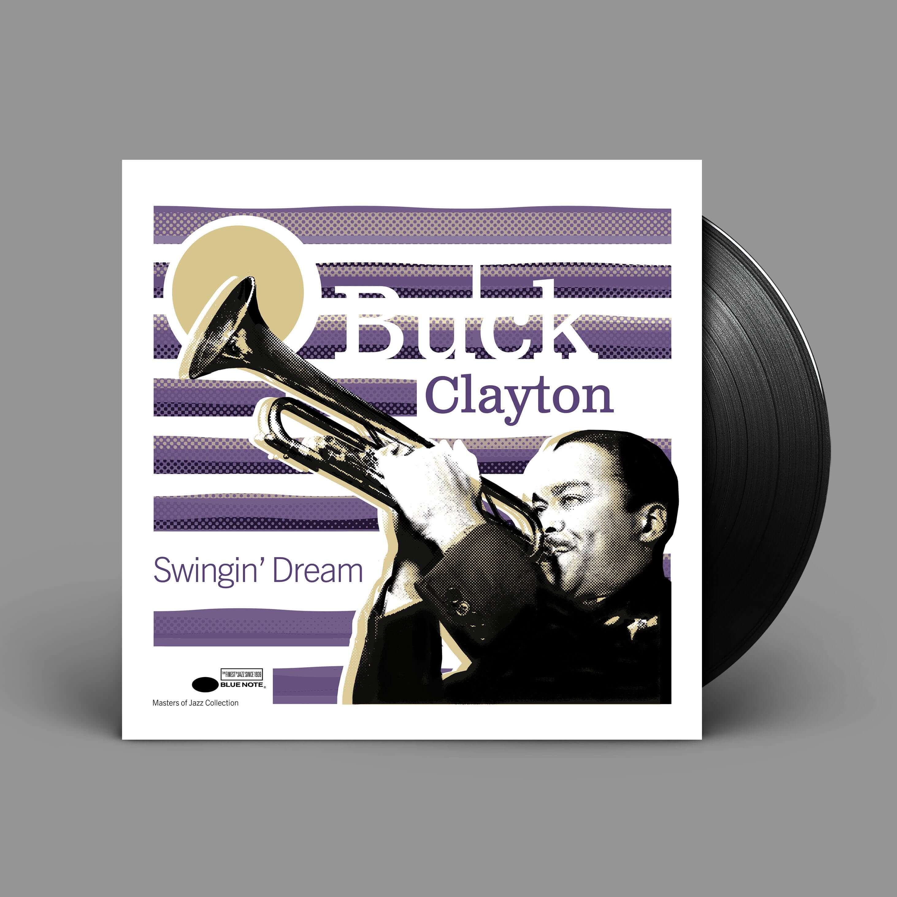
Final Solution
Swingin' Dream Album Cover
Final Outcome
An album cover that successfully captures both the emotional atmosphere and visual rhythm of Buck Clayton's performance style through strategic reductive photography and thoughtful design integration.
- High-contrast, reductive halftone treatment of Buck Clayton performance photo
- Soft lavender and neutral color palette evoking dreamy swing atmosphere
- Asymmetrical layout with dynamic diagonal movement
- Clean sans-serif typography aligned with Blue Note legacy
Visual Language
- Photo Treatment — High-contrast, reductive, halftone with vintage tactility
- Color Palette — Lavender, black, cream, soft gray
- Typography — Bold sans-serif with minimal interference, inspired by Blue Note's iconic covers
- Layout — Diagonal and curved movement reflecting swing phrasing
- Cultural Sensitivity — Respectful homage to Blue Note's timeless aesthetic with personal interpretation
Results & Reflection
Project Outcomes:
- Musical Translation: Successfully demonstrated how minimal form and visual rhythm can express musical feeling
- Historical Integration: Merged historic jazz photography with modern reduction techniques
- Brand Alignment: Honored Blue Note's timeless aesthetic while infusing personal interpretation
- Design Innovation: Developed effective reductive photography methodology for album design
Key Learnings:
This project demonstrated how minimal form and visual rhythm can express musical feeling. By merging historic jazz photography with modern reduction techniques, the final cover pays homage to Blue Note's timeless aesthetic while infusing it with personal interpretation and emotional tone.
Key Takeaways:
- Design can echo music structurally and emotionally
- Reduction is a powerful tool when paired with intentional layout and visual metaphor
- Album covers can serve as narrative compositions, not just packaging
- Cultural sensitivity and historical respect enhance rather than limit creative expression