Historical Poster Styles
A nine-poster series exploring historical design movements through distinct approaches to typography, color, collage, grids, and composition.
- Deliverables
- Nine posters, thumbnail studies
This series examines how historical graphic design movements use visual structure to communicate ideas. Each poster responds to a different style or reference, using its typographic and compositional principles to shape a contemporary interpretation.
The goal was not simply to imitate historical aesthetics, but to understand how the choices behind each style affect the way a message is communicated.
- Research into historical design movements
- Visual analysis and reference collection
- Thumbnail sketches and composition studies
- Nine poster designs
- Written reflections on design decisions
Reading the originals
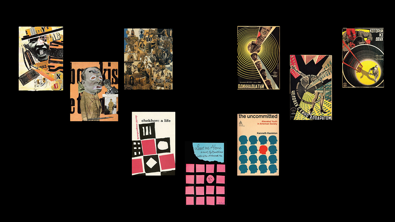
For each poster I started with the real thing: a Dada photomontage, a Stenberg brothers poster built on concentric circles, and mid-century book covers made from blocks of flat color and cut paper shapes. I looked at how each one uses type, color and structure to make its point, then chose what to borrow.
Thumbnails first
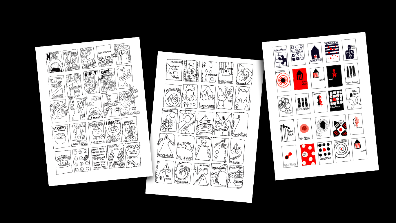
Before any final art, I filled sheets with small black-and-white thumbnails to test where type and image would sit. Some are already close to the finished posters, like Harvest, and a later sheet starts bringing in red.
Concept development
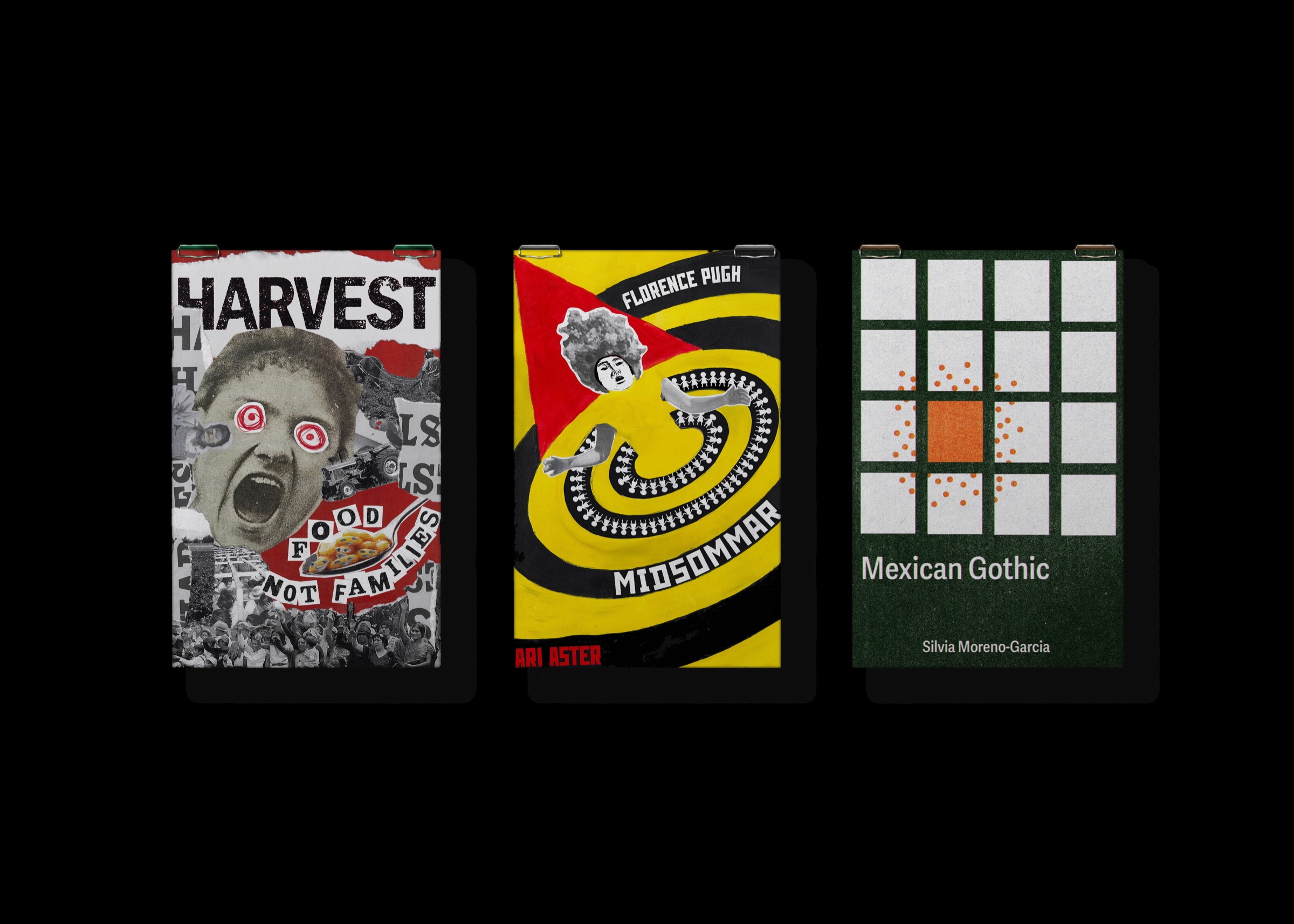
I wasn't trying to recreate the originals. A copy of a Stenberg poster is just a Stenberg poster. For each one I took the structure, like the grid, the spiral or the cut-up type, and applied it to a subject from now, like Midsommar or Mexican Gothic. The nine posters share almost nothing on purpose, so each movement's actual moves stay visible.