Historical Poster Styles
A nine-poster series exploring historical design movements through distinct approaches to typography, color, collage, grids, and composition.
- Deliverables
- Nine posters, thumbnail studies
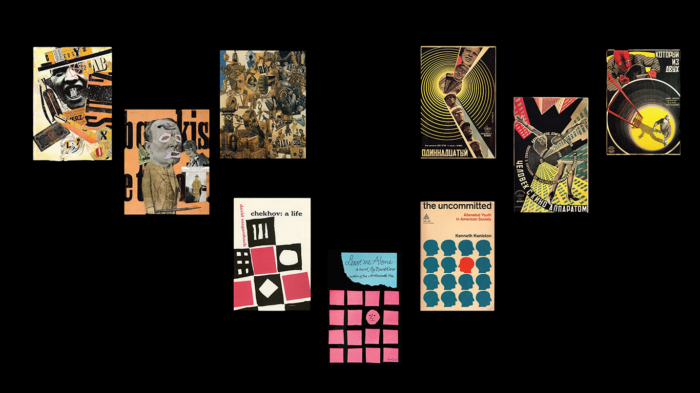
This series examines how historical graphic design movements use visual structure to communicate ideas. Each poster responds to a different style or reference, using its typographic and compositional principles to shape a contemporary interpretation.
The goal was not simply to imitate historical aesthetics, but to understand how the choices behind each style affect the way a message is communicated.
- Research into historical design movements
- Visual analysis and reference collection
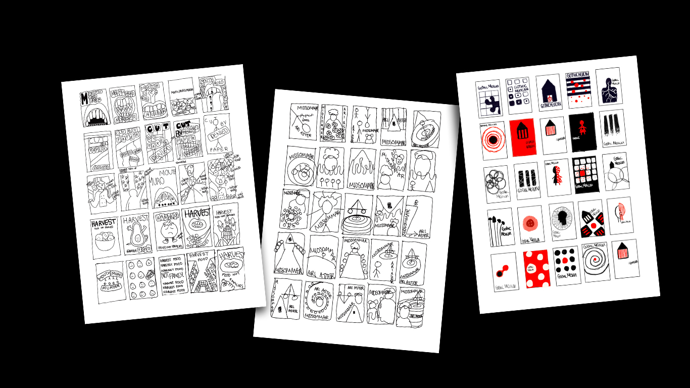
- Thumbnail sketches and composition studies
- Nine poster designs
- Written reflections on design decisions
Research, thumbnails, concept
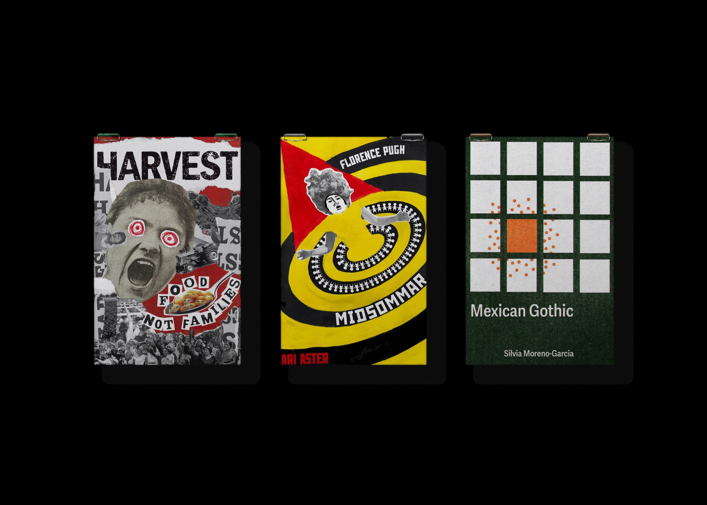
Each poster uses a different visual strategy to suit its subject. A black-and-white poster built around the phrase Between Thought and Expression Lies a Lifetime uses tall condensed capitals in a fragmented, Dada-inspired composition. Harvest combines a halftone screaming face and red eyes with collaged typography, while the Mexican Gothic poster uses a rigid green grid interrupted by a single orange block.
Other posters explore a yellow, red, and black spiral for Midsommar, a dark silhouette against navy for War Kills Peace, a pink riot grrrl-inspired collage for Hole, and swirling psychedelic lettering in yellow, blue, and orange.
These differences are deliberate. The grid-based composition creates order, while collage and distorted lettering introduce disruption and movement. Presenting the series together makes those contrasts visible and demonstrates how typography, color, and layout can change to reflect different design principles and subjects.