Threads
A logotype for a youth clothing retailer, drawn as a continuous looping line in copper brown and extended into an animated version.
- Role
- Graphic design, motion design
- Deliverables
- Static logotype, woven graphic elements, animated logotype
For Threads, I wanted the wordmark to communicate the brand's connection to clothing through the construction of the lettering itself. Instead of adding a separate sewing or textile symbol, I explored whether the letters could behave like a single strand of thread.
The challenge was to create a connected form that felt expressive while keeping the name readable.
- Existing logotype research and analysis
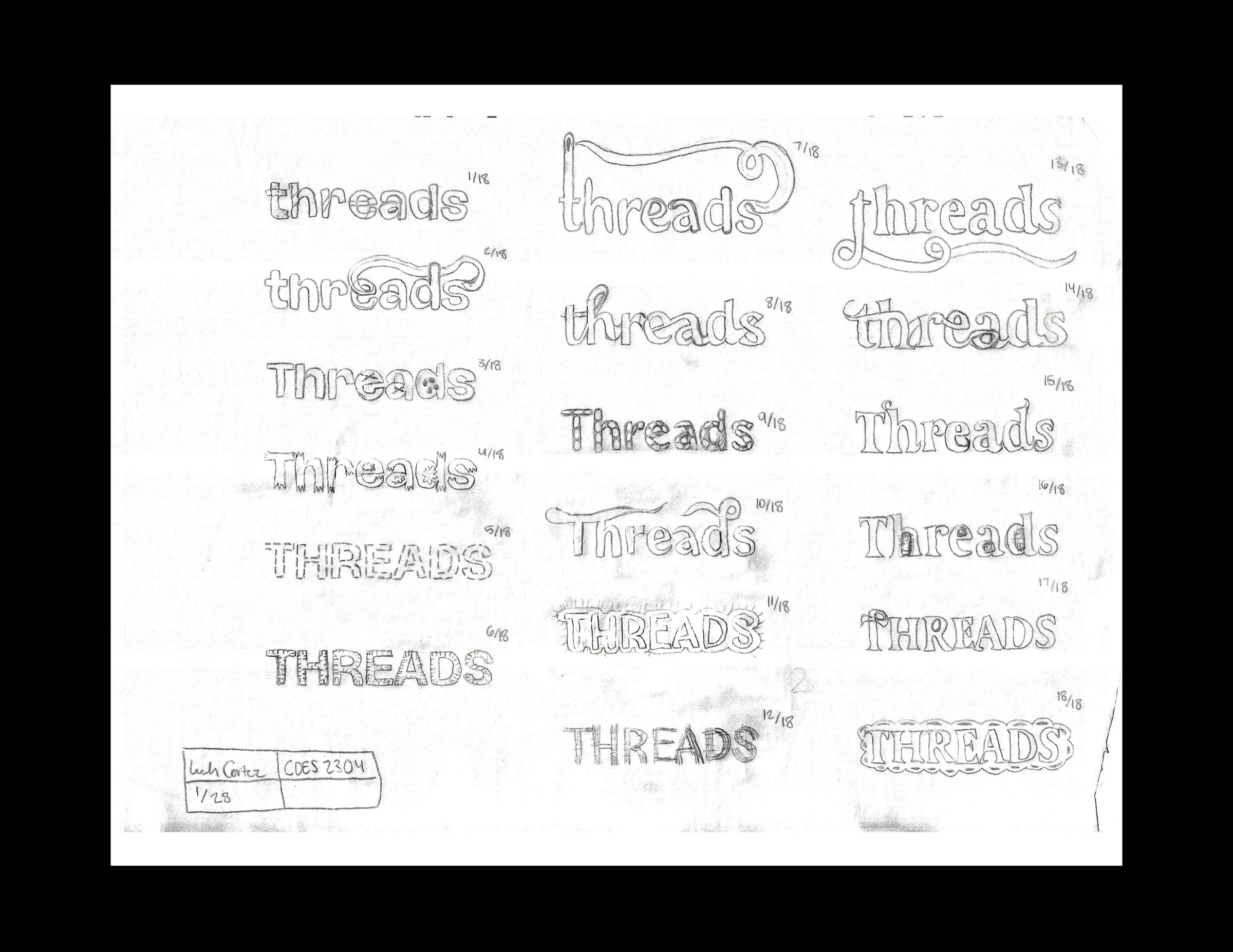
- Letterform sketches
- Vector logotype development
- Supporting graphic elements
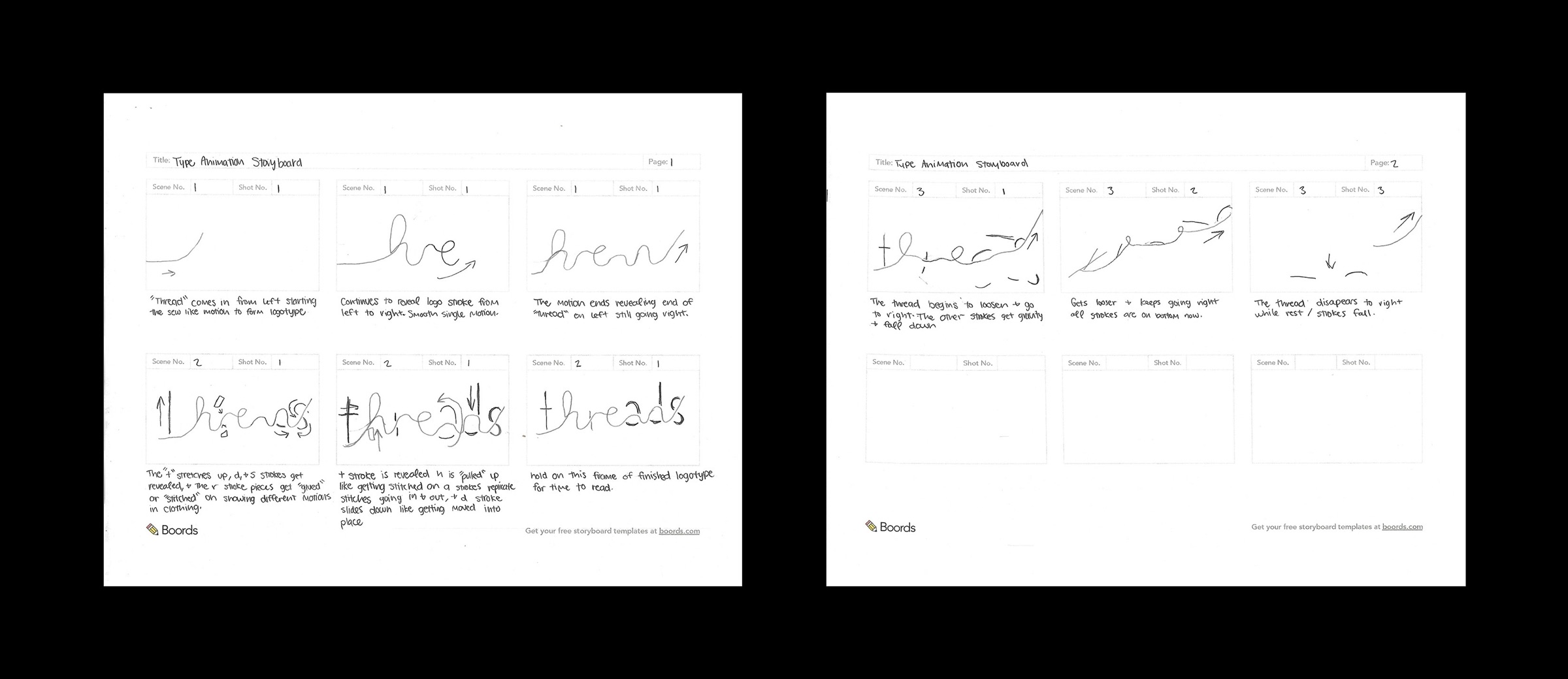
- Animated logotype
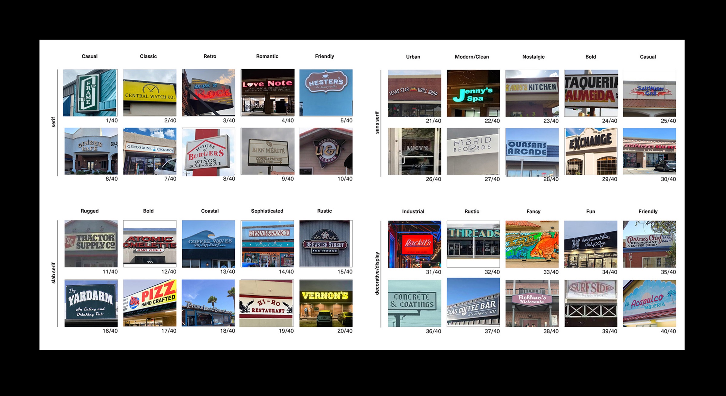
Fifty logotypes, sorted.
I looked at 50 different logotypes and categorized them, to see which kinds of letterforms and structures other brands lean on. That gave me a map of what already exists, and where Threads could stand apart.
One continuous line.
I sketched the letters as a single thread that loops and crosses itself, testing how far a stroke could bend before the word stopped reading.
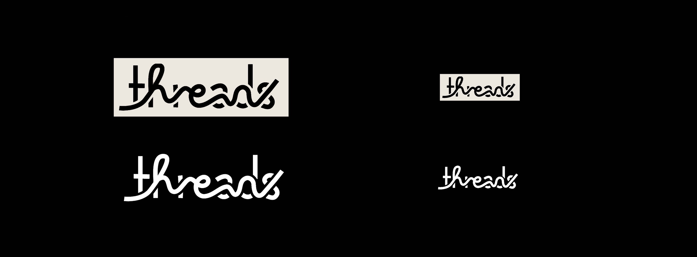
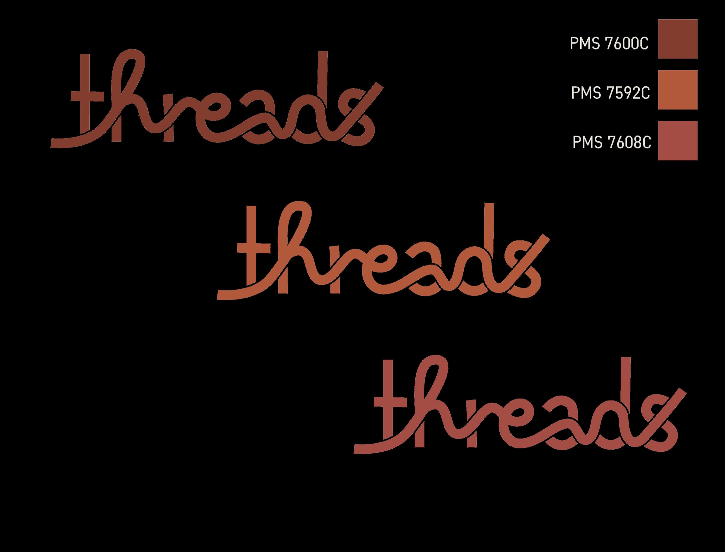
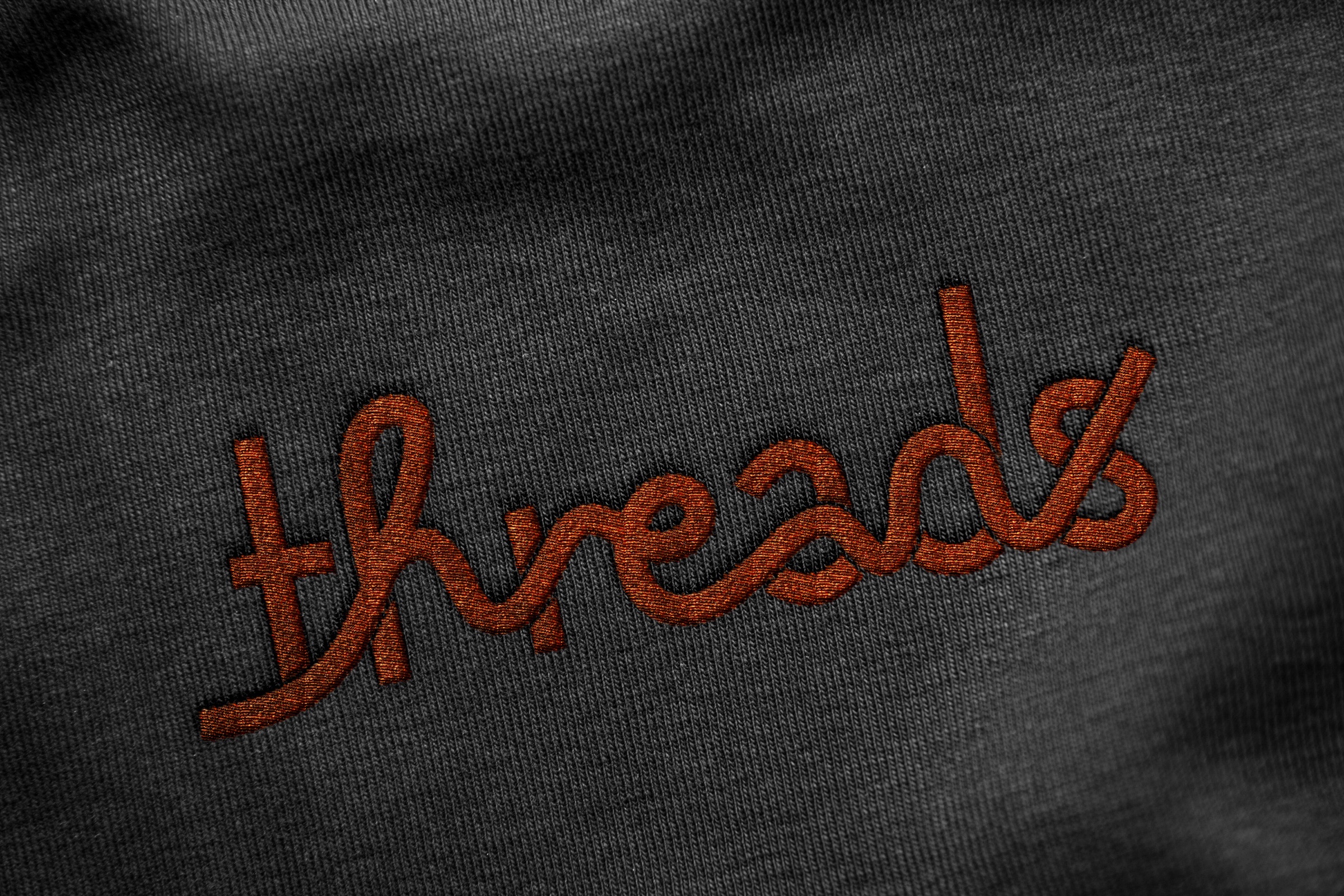
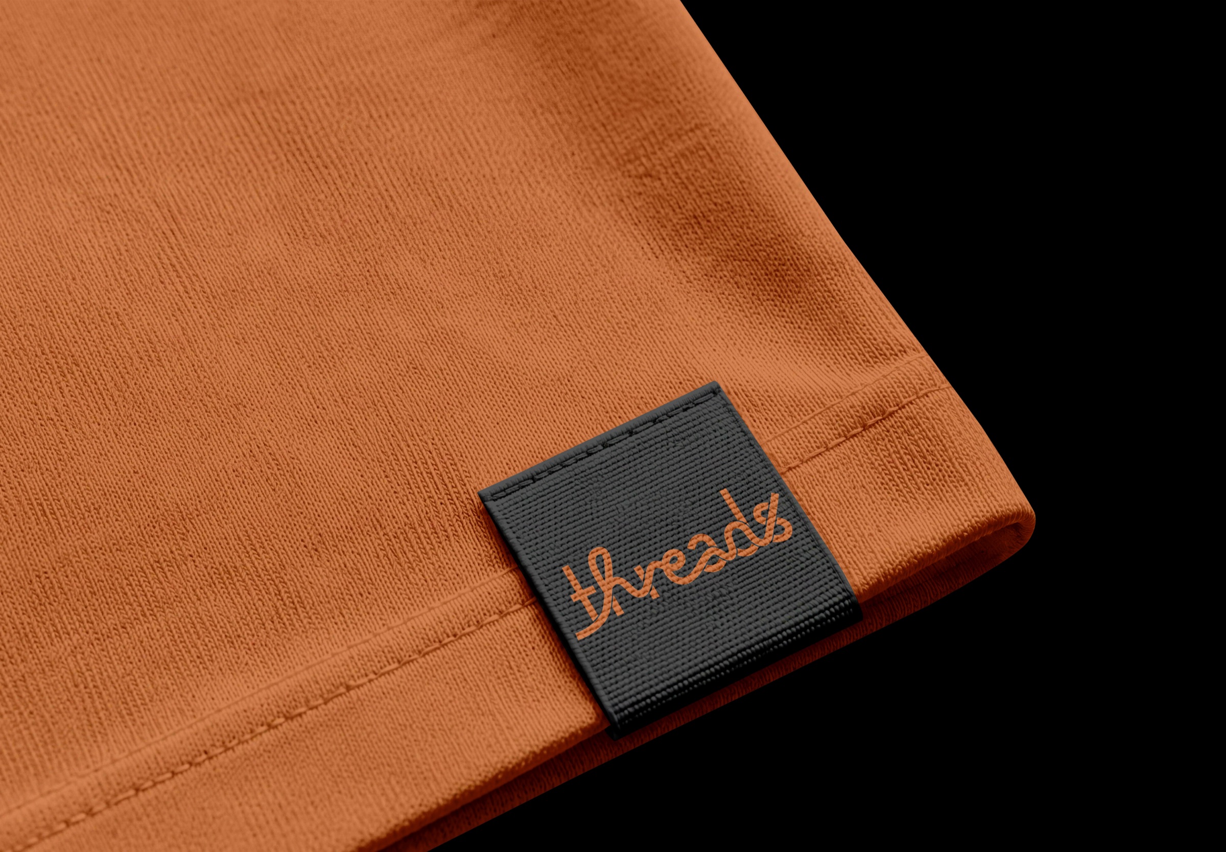
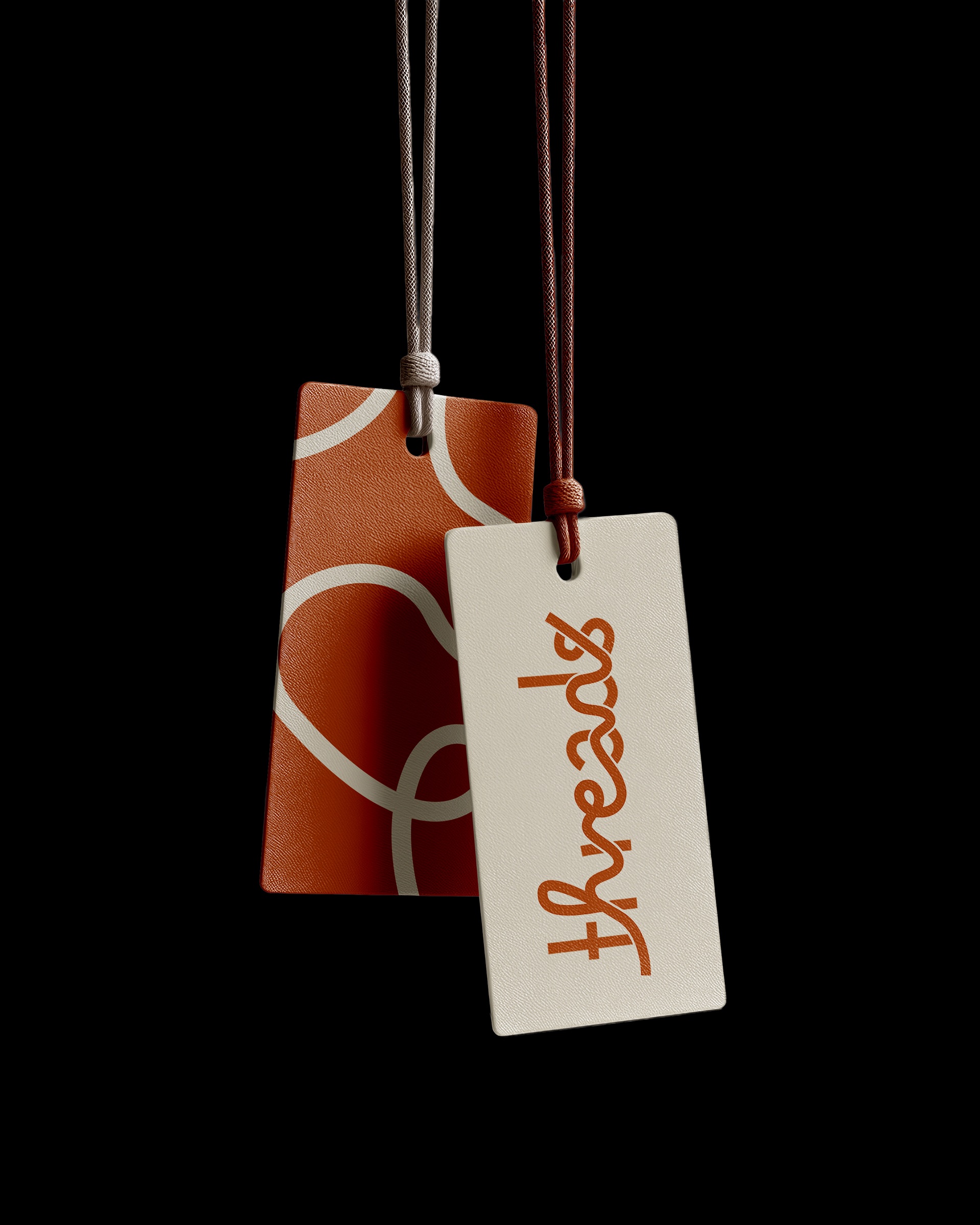
The lowercase wordmark is drawn as one continuous line, with loops and crossings connecting the letters. These connections reference thread moving through fabric, making the concept part of the letterforms rather than an additional graphic.
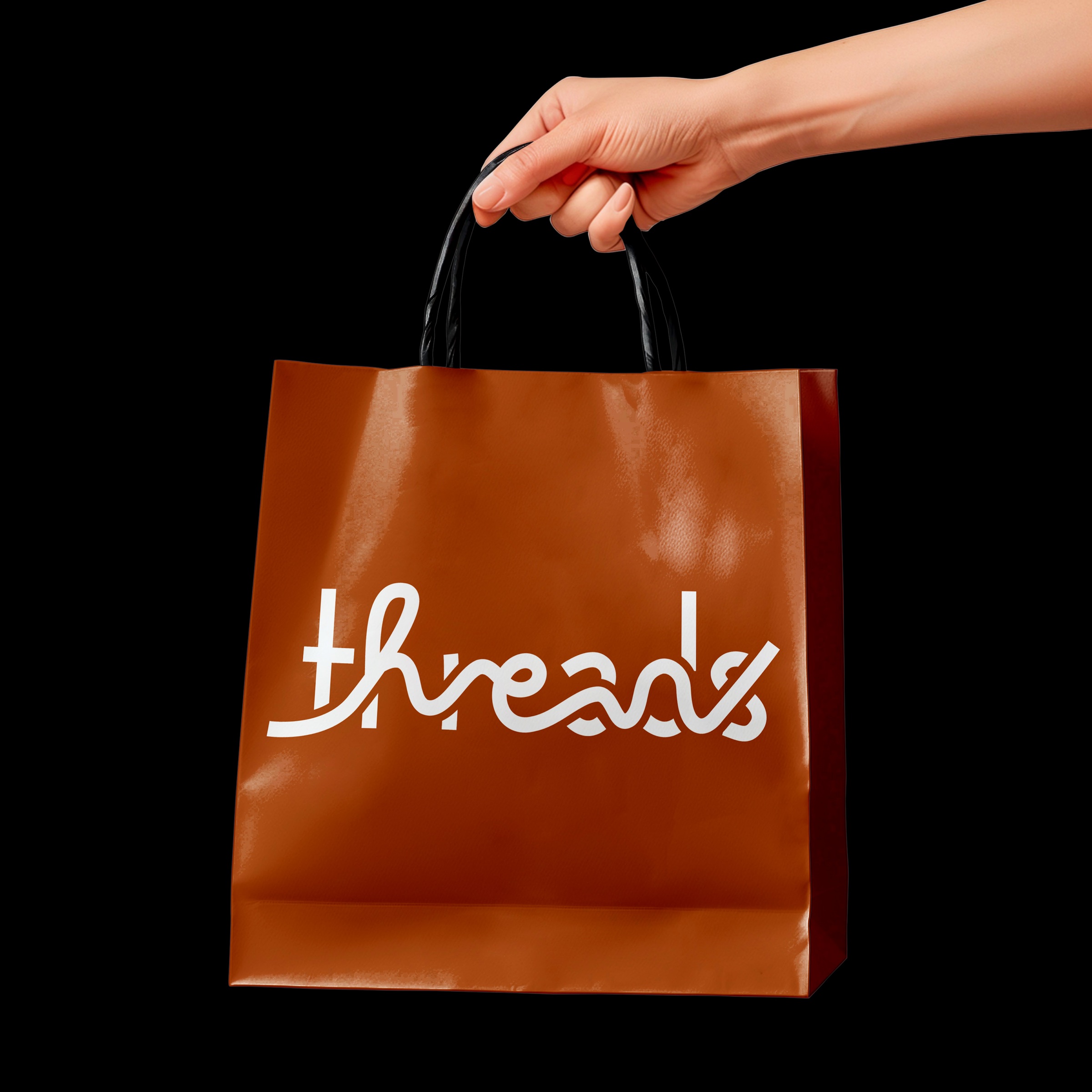
The mark is presented in warm copper brown on a plain white paper shopping bag with matching twisted handles. Keeping the bag free of other graphics allows the line work to carry the identity and creates a direct relationship between the logo and its physical application.
The animated version extends the continuous line into motion. Both versions use the same underlying idea, allowing the identity to move between a static retail application and a digital format without losing its defining characteristic.