Modernism Movement
Concept
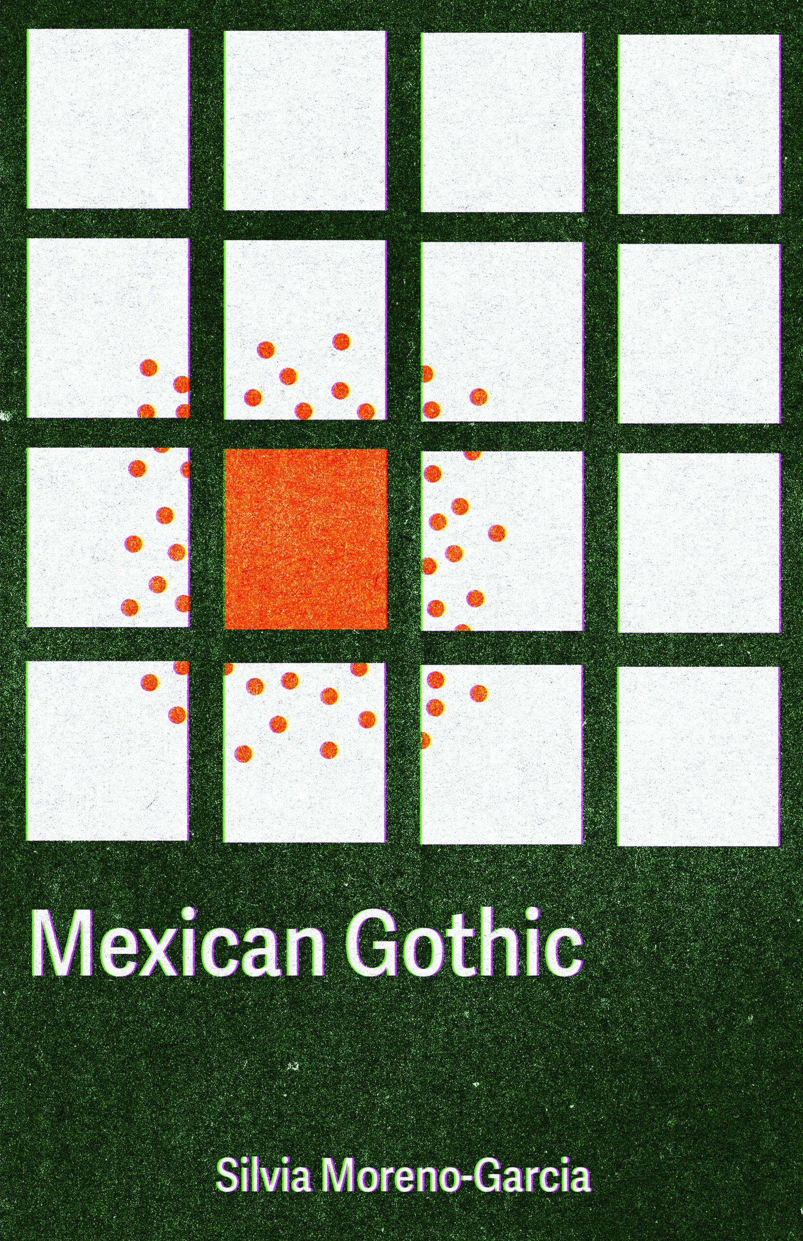
This book cover for Mexican Gothic explores Modernist design principles—clean grids, geometric structure, and rational order—deliberately disrupted by organic, unsettling elements. The goal was to visualize the novel's tension between European colonial architecture and the decay lurking beneath its orderly surface.
Design Approach
The design begins with a strict Modernist grid system and Swiss typography, establishing visual order and rationality. This structured foundation is then invaded by organic forms: sprawling vines, fungal growth, and biological textures that break through the geometric framework. The typography remains clean and sans-serif, but its placement is gradually destabilized by the encroaching natural elements. Color transitions from cool, clinical whites and grays into sickly greens and decayed tones. The grid itself warps and fragments where organic matter overtakes it, creating visual unease.
Result
The cover successfully communicates gothic horror through the subversion of Modernist aesthetics. The tension between geometric order and organic chaos mirrors the novel's themes of colonial legacy and natural corruption, showing how disrupting design conventions can create psychological impact.