.jpg)
Snack Packaging
Insane Grain Brand Identity
Concept
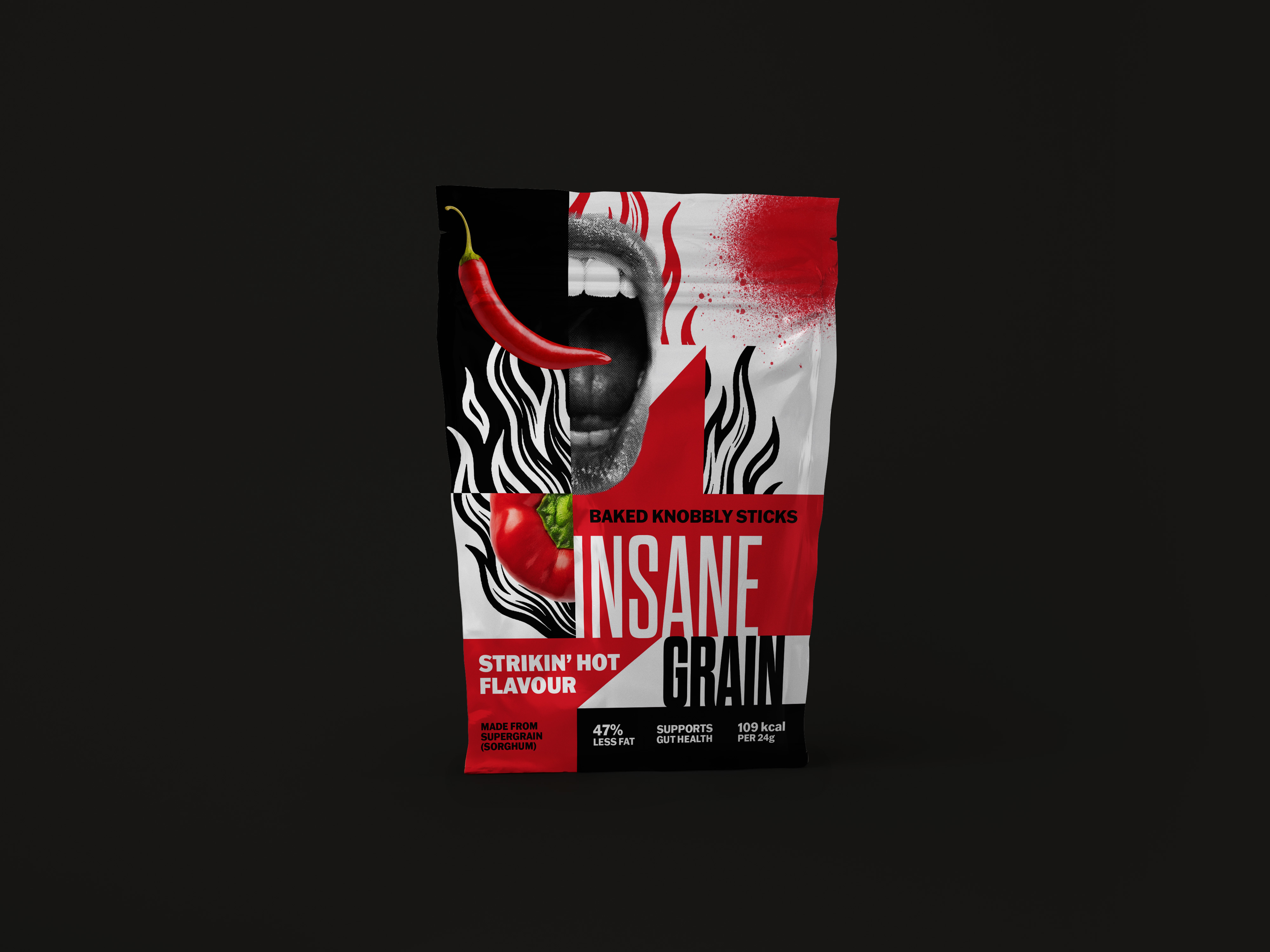
This rebrand reimagines Insane Grain, a health snack brand whose existing packaging didn't capture the energy and boldness of its name. The goal was to create packaging that appeals to younger, trend-conscious audiences while communicating the brand's commitment to health through sorghum and gut health benefits.
Design Approach
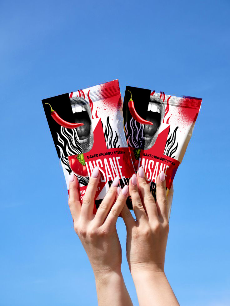
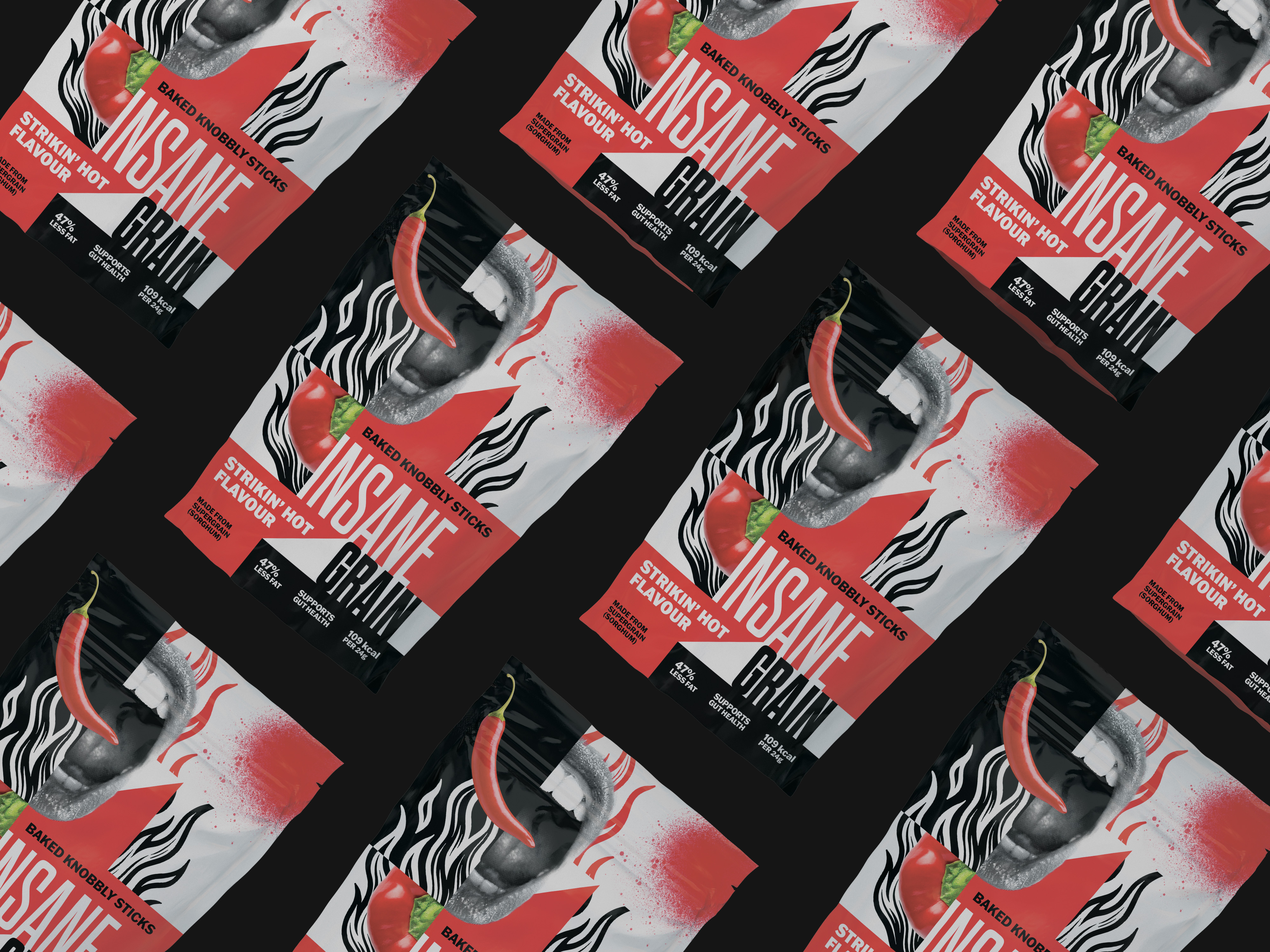
The design embraces a collaged graffiti street style with punk aesthetics, creating a commercialized yet authentic visual language. Layered textures and bold color contrasts create compositional chaos that embodies "insane" while maintaining readability through strategic hierarchy. The street art influence positions the brand as rebellious and contemporary, breaking away from traditional health food aesthetics. Despite the visual intensity, key product information and health benefits remain clear and accessible.
Result
The packaging successfully bridges the gap between bold visual identity and functional communication. The design experiments with controlled chaos—pushing compositional boundaries while ensuring consumers can quickly identify the product's health benefits. The rebrand transforms Insane Grain into a visually distinctive option in the health snack market, appealing to audiences seeking both wellness and edge.